Product Fit
Sizing, inserts and structure planned around how the item sits inside.
Choose the materials, structure, print method, inks, finishes, inserts and proofing options that shape how your custom paper and cardboard packaging looks, feels and performs.

Strong packaging starts before artwork is printed or a box is cut. The board choice affects strength and feel, the structure controls how the product fits, the print method shapes colour quality and the finish changes how the surface looks in hand. For paper and cardboard-led packaging, these details work together. A rigid presentation box needs different board and finishing choices from a postal mailer, while a food sleeve, retail carton or product insert has its own sizing and handling needs. This page explains the main customisation choices available through Custom Packly UK so you can compare materials, print, colour, finishes, dielines, inserts, samples and sustainability considerations before requesting a quote.
Every product moves through more than one stage before it reaches the customer. The right packaging should support storage, packing, handling, delivery, display and the final opening experience.
Sizing, inserts and structure planned around how the item sits inside.
Boxes, sleeves and bags chosen for easier folding, filling and closing.
Board strength and closure style matched to shipping and courier movement.
Print areas, front panels and finishes planned for clear product presentation.
The reveal, finish and insert fit shaped around first impression.
Specifications kept clear so future runs stay consistent and easier to reorder.
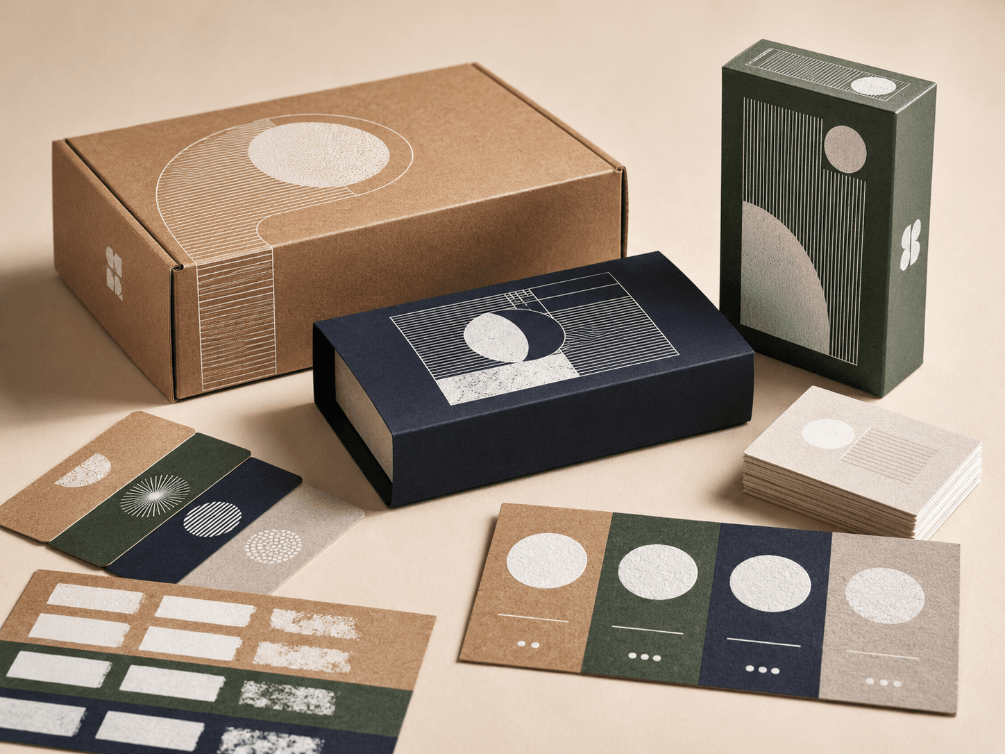
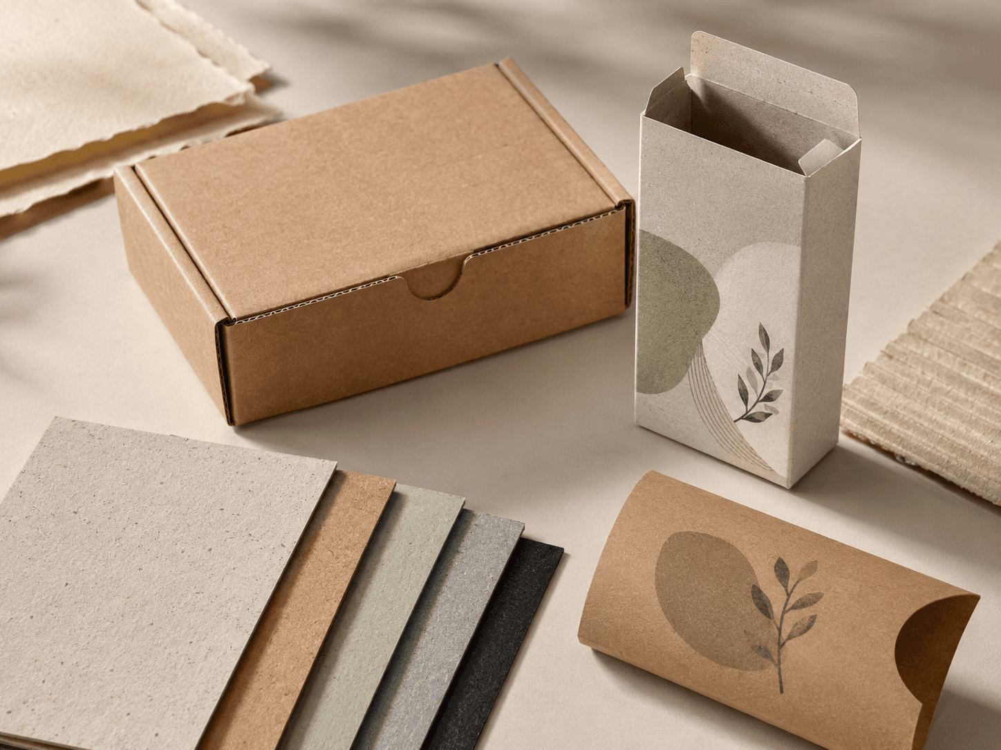
Subtext: Select paperboard, kraft, corrugated board, rigid board or speciality stock based on strength, finish and print needs.
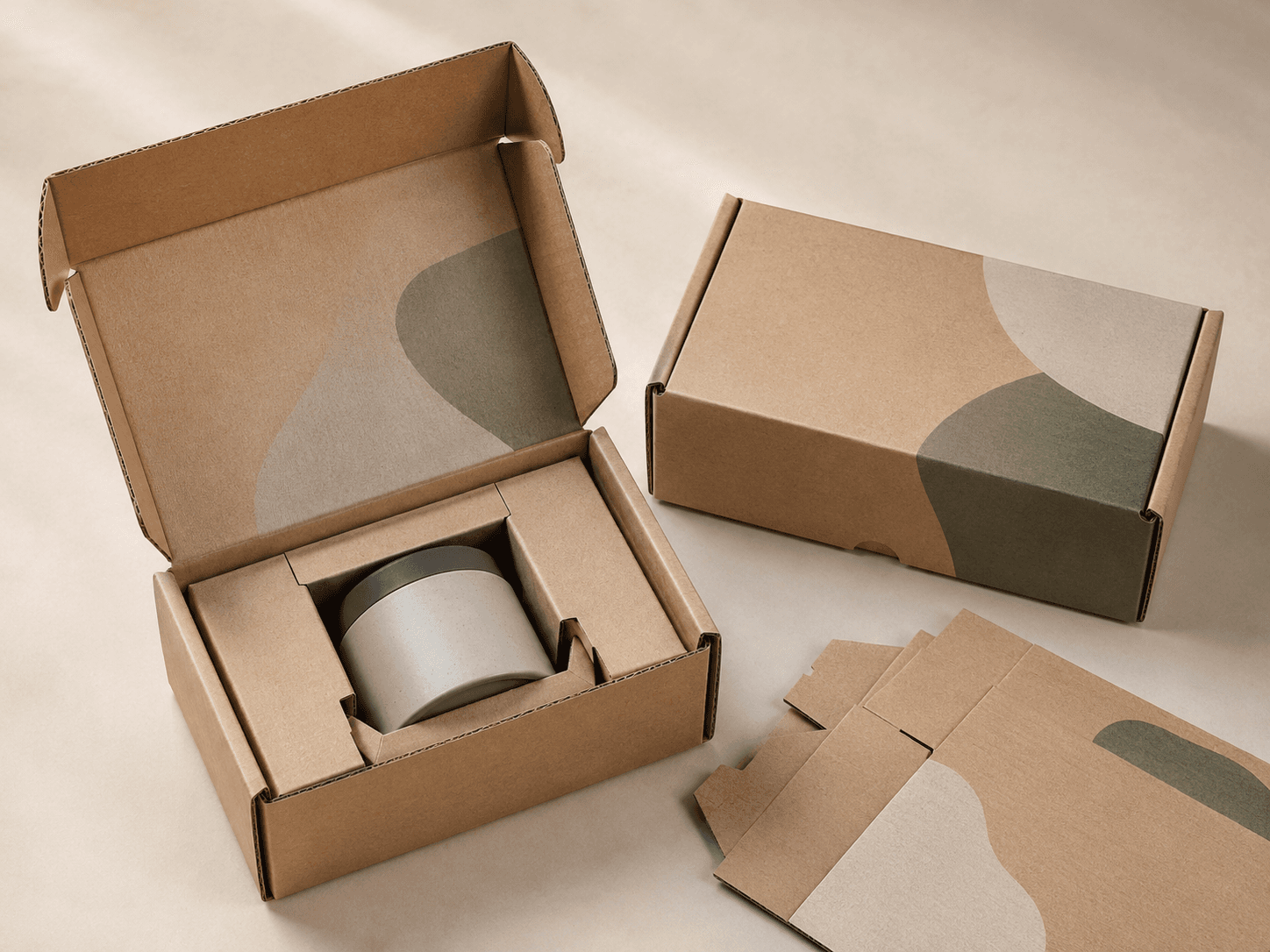
Adjust dimensions, panels, openings, flaps and closures so the packaging fits the product properly.
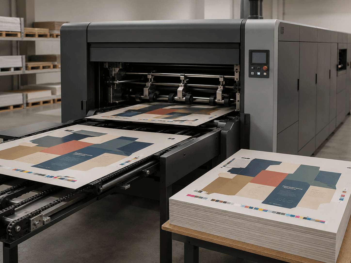
Choose digital, offset or flexographic printing based on artwork detail, order quantity and production needs.
Use CMYK, Pantone matching, rich black, white ink or inside print colour for controlled brand presentation.
Add matte, gloss, soft-touch, foil, embossing, debossing or spot UV for a more refined surface.
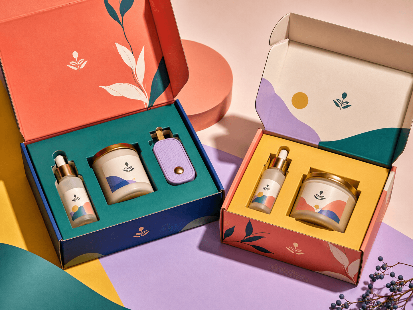
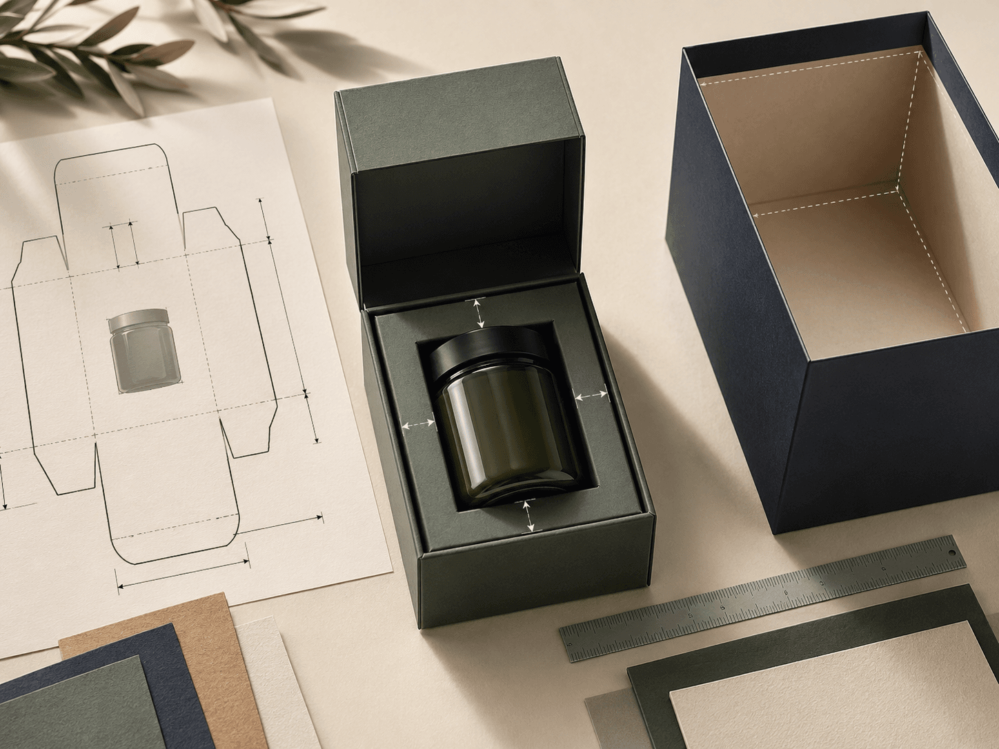
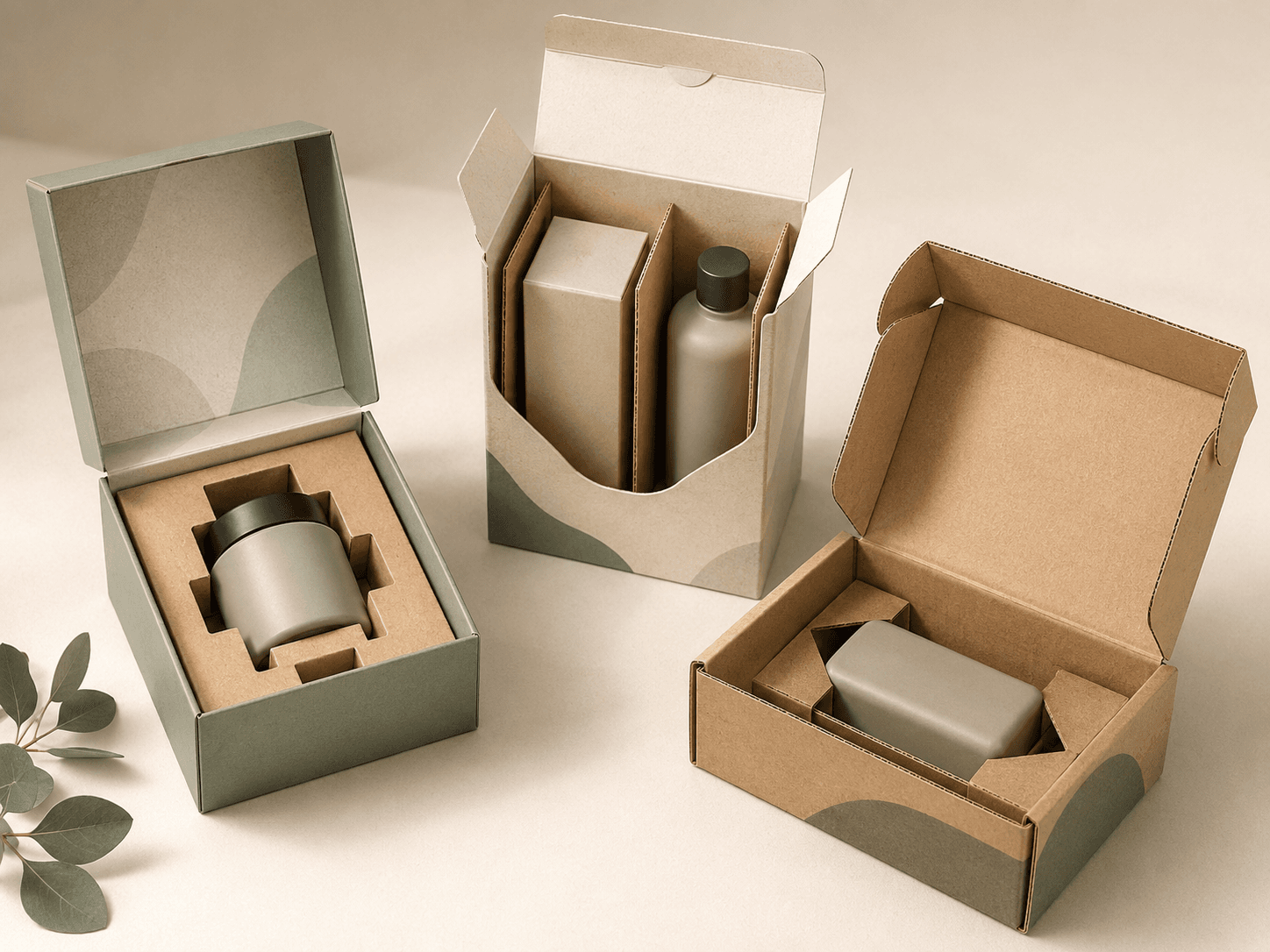
Improve product fit with cardboard inserts, corrugated partitions, die cut cradles, dividers or layer pads.
Review structure, board, colour, print and finish details before moving into full production.
Reduce waste with right-sized packaging, paper-based inserts, recyclable board choices and efficient storage.
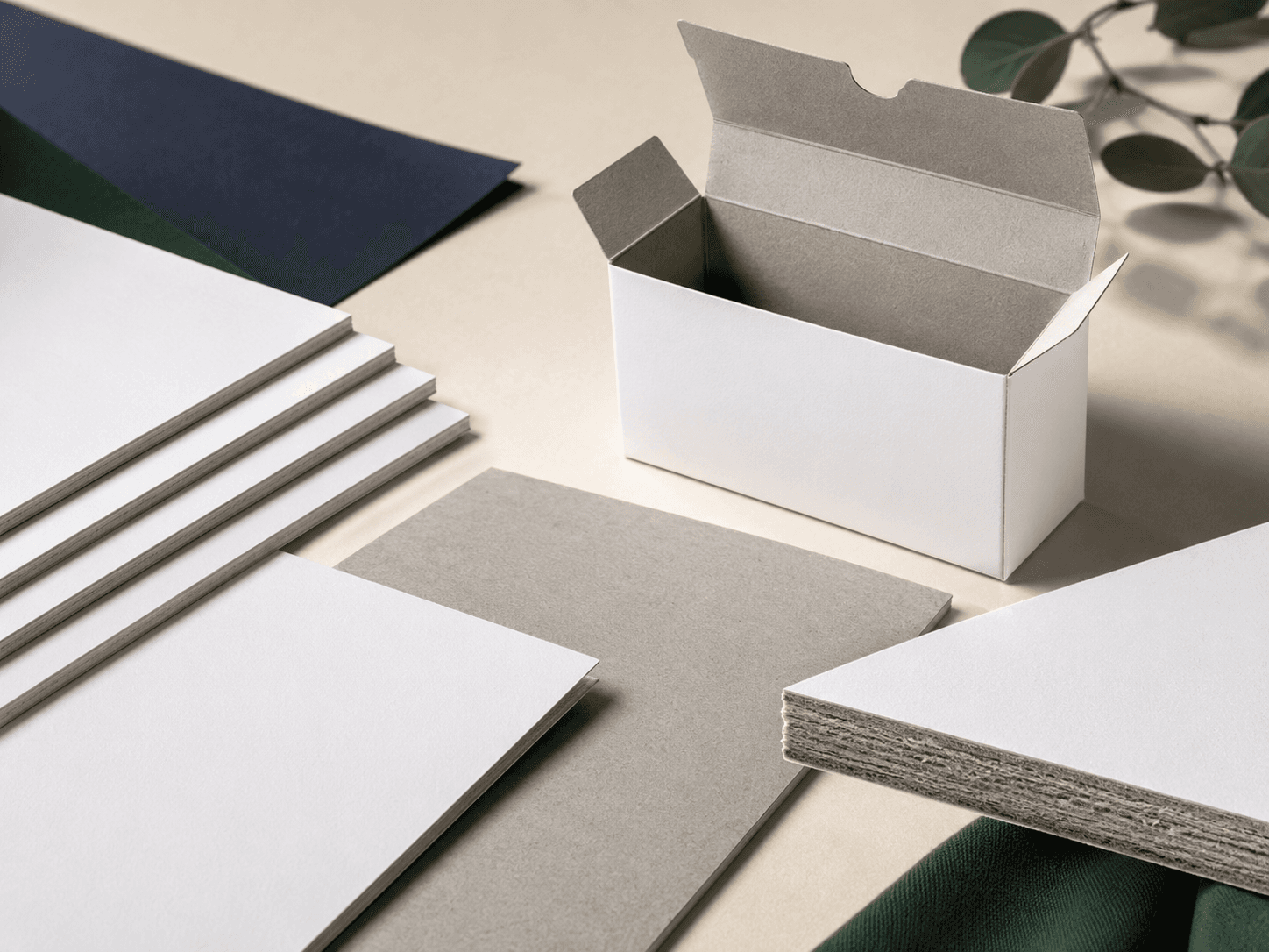
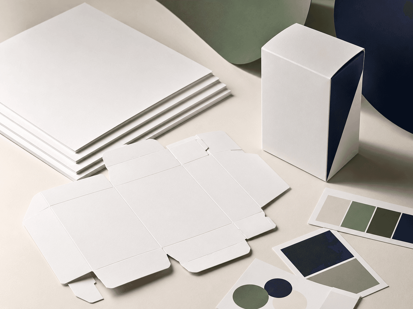
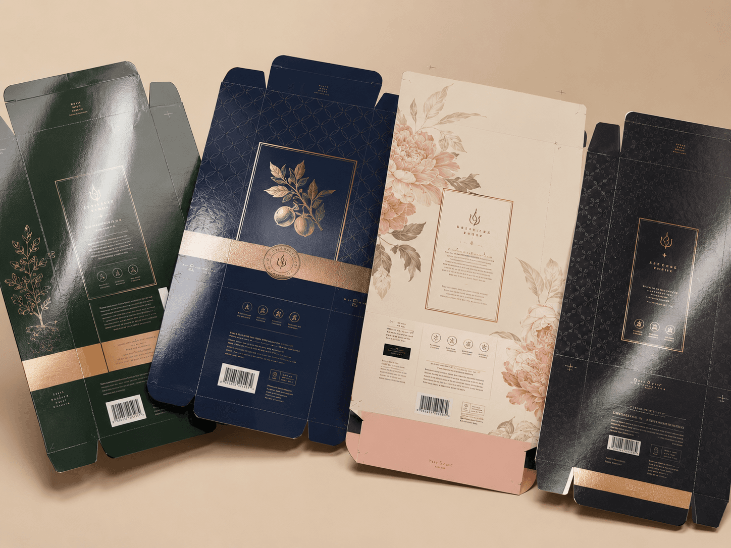
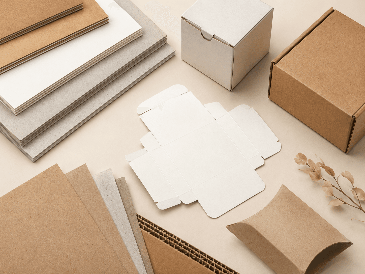
The board sets the base for every packaging decision. It affects how the structure folds, how well the product is protected, how colour appears on the surface and how premium the finished packaging feels. The best choice depends on product weight, handling, display use, artwork coverage and finish requirements.
Smooth, foldable board for cartons, sleeves, product boxes and lightweight retail packaging.
Natural brown stock for earthy, recyclable and understated packaging with a warmer surface tone.
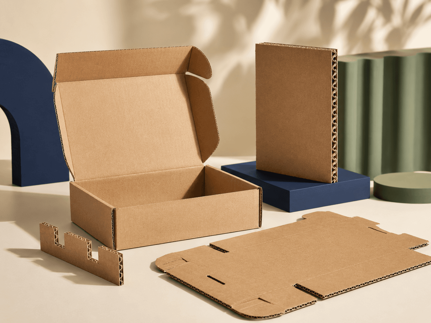
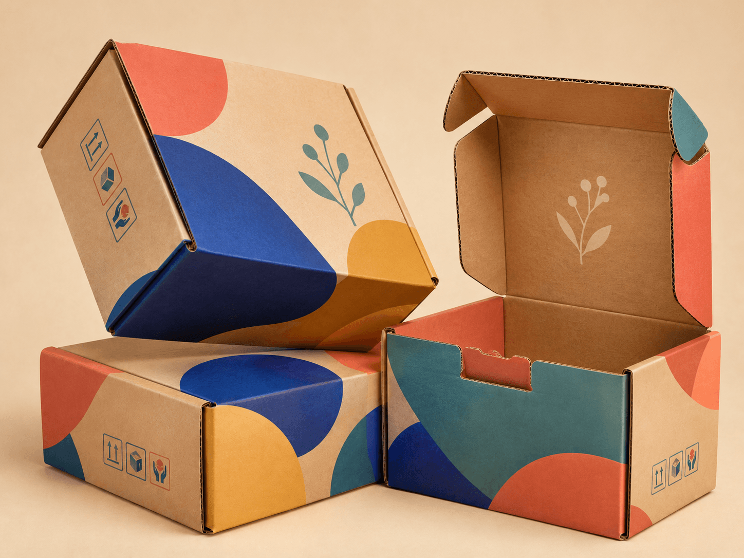
Fluted board for mailer boxes, postal boxes, shipping boxes and protective delivery packaging.
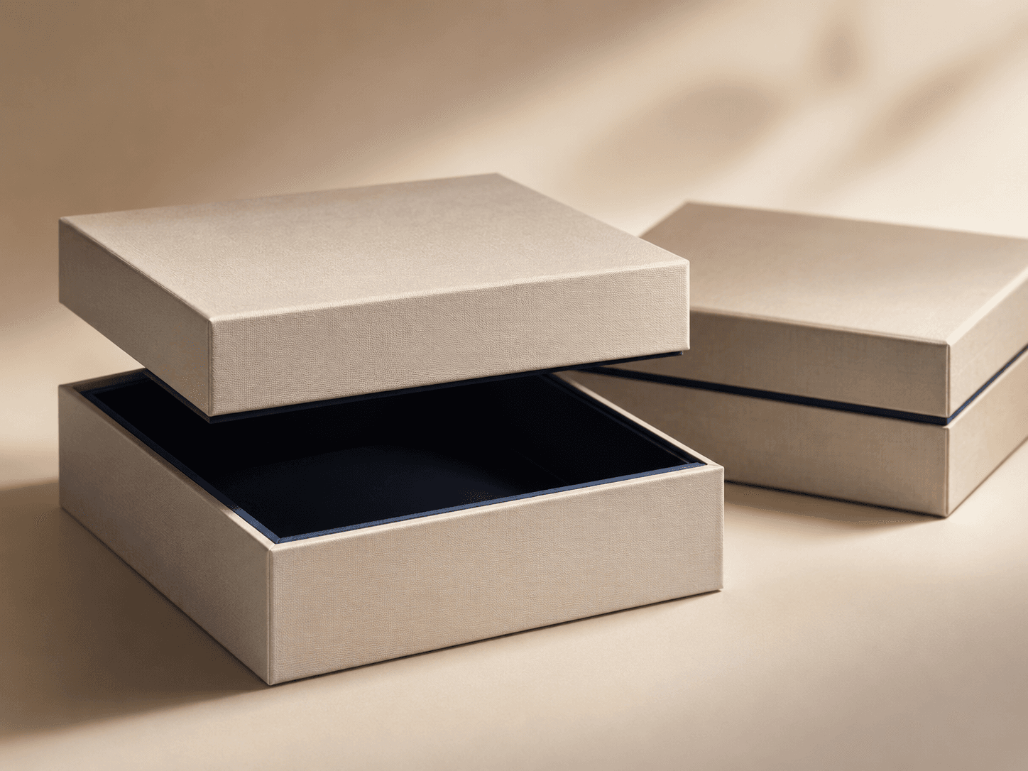
Thick board for premium presentation boxes, gift packaging and luxury product launches.
Practical board for printed cartons, retail boxes and cost-conscious paper-based packaging.
Clean white stock for crisp print, premium colour reproduction and refined carton presentation.
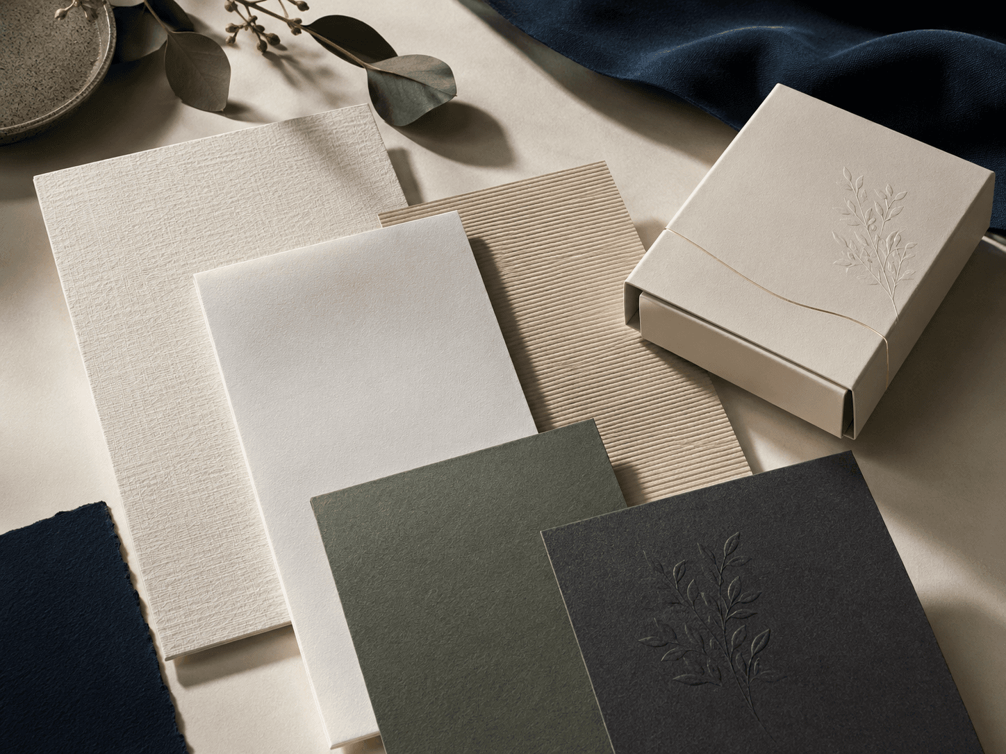
Distinctive surfaces for tactile packaging, luxury finishes and more memorable brand presentation.
Use this table to compare common paper-based board choices before selecting a packaging style, print method or finish.
| Board Type | Best For | Feel or Strength | Common Uses |
|---|---|---|---|
| Paperboard | Retail cartons and sleeves | Smooth and lightweight | Product boxes, sleeves and folding cartons |
| Kraft board | Natural brand styles | Earthy and recyclable feel | Food sleeves, mailers and paper bags |
| Corrugated board | Transit and ecommerce | Stronger cushioning | Mailer boxes, shipping boxes and postal boxes |
| Rigid board | Premium presentation | Thick and sturdy | Rigid Boxes, gift boxes and jewellery boxes |
| Duplex cardboard | Practical printed boxes | Cost-effective and printable | Retail cartons and product boxes |
| SBS stock | High-quality colour work | Smooth and bright | Beauty, wellness and premium retail boxes |
| Textured stock | Tactile presentation | Distinct surface feel | Gift packaging, luxury sleeves and presentation boxes |
The right board should match the product’s weight, handling journey, print coverage and presentation level. For example, corrugated board is usually stronger for delivery while rigid board is better for high-value presentation.
Printing should be selected around artwork complexity, order quantity, board surface and the finish that will be applied afterwards. The right method supports the design without making the finished packaging heavier, slower or more expensive than needed.
Flexible print choice for shorter runs, quick artwork changes and small batch packaging.
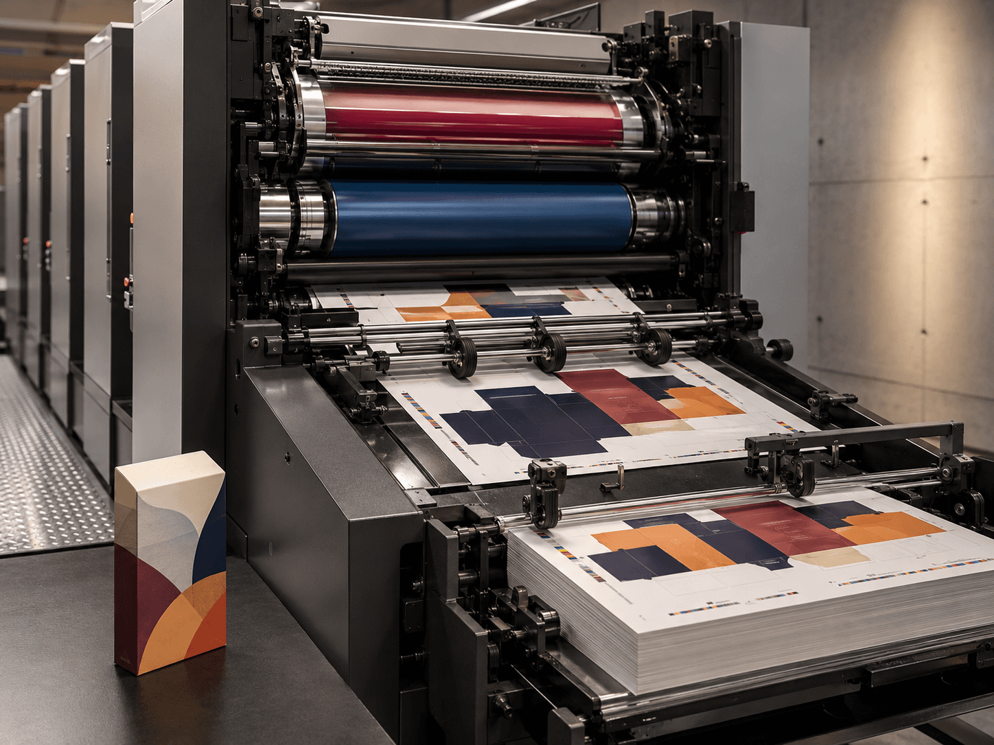
High-quality print method for sharper detail, smoother colour and larger production runs.
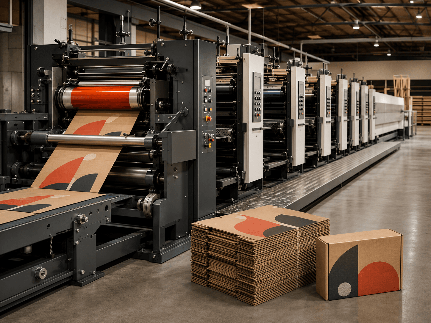
Efficient option for simpler graphics, corrugated packaging and repeat production requirements.
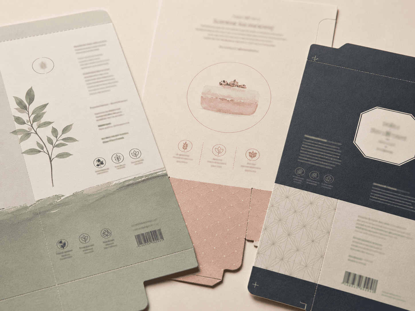
Add artwork inside the box, outside the box or across both surfaces for a fuller brand reveal.
Printing method affects colour quality, cost, production speed and how well artwork works on different board surfaces.
| Print Method | Best For | Main Strength | Consider Before Ordering |
|---|---|---|---|
| Digital printing | Short runs and launch batches | Fast and flexible | Best for smaller quantities |
| Offset printing | Premium printed packaging | Sharp detail and colour control | Stronger for larger runs |
| Flexographic printing | Corrugated and repeat production | Efficient for simpler artwork | Less suited to complex gradients |
A print choice should be made after the board and artwork direction are clear. Detailed artwork, heavy ink coverage, inside printing and premium finishes all need careful file preparation before production.
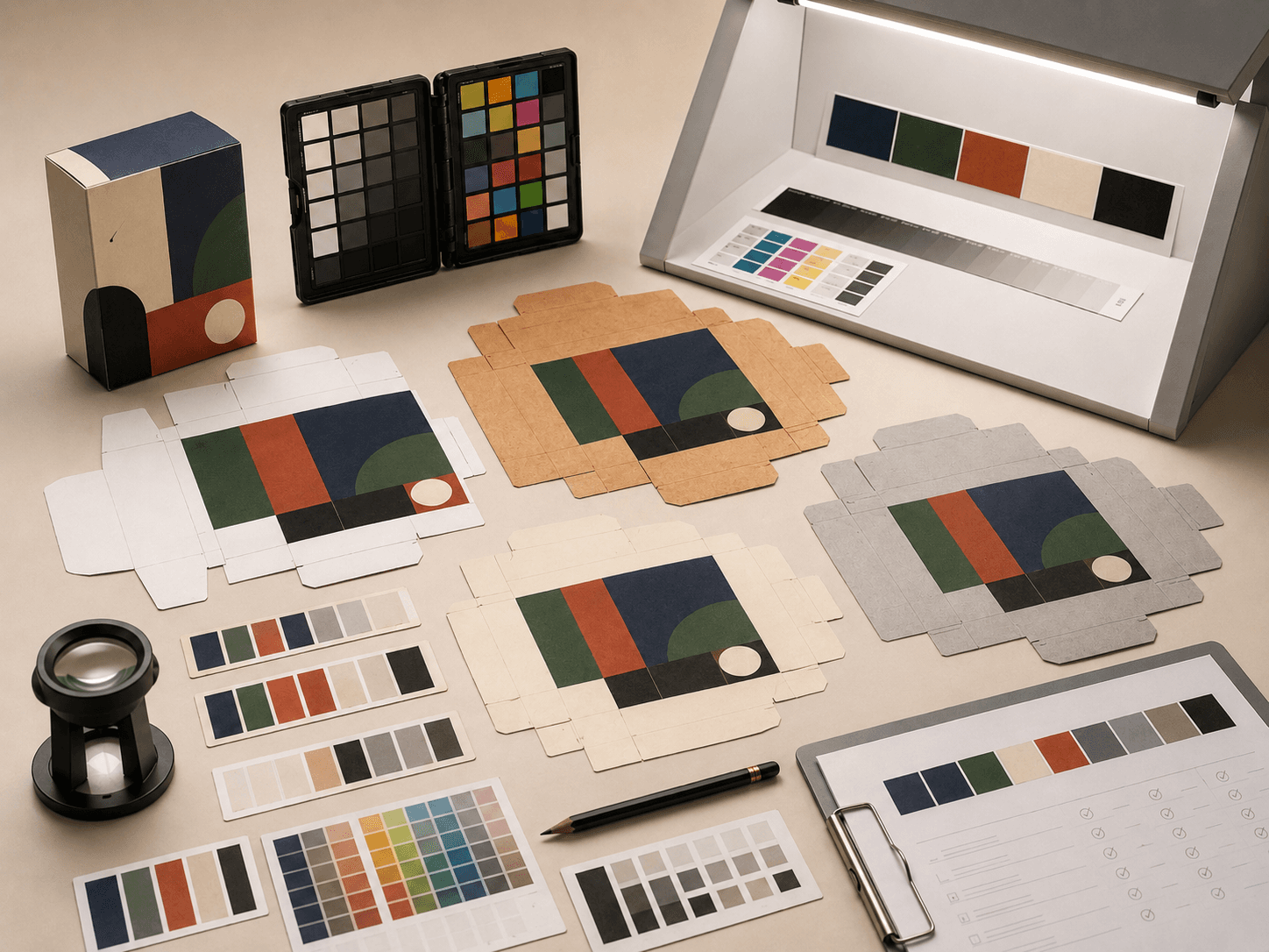
Colour planning is separate from choosing a print method. CMYK, Pantone, rich black, white ink and inside colour choices all affect how the packaging looks once printed on paperboard, kraft, corrugated or textured stock.
Full-colour printing for artwork, gradients, product illustrations and flexible packaging graphics.
Better control for brand colours that need stronger consistency across production runs.
Useful for dark packaging, luxury designs and artwork that needs stronger colour depth.
Helps artwork stand out on kraft, coloured or darker board surfaces.
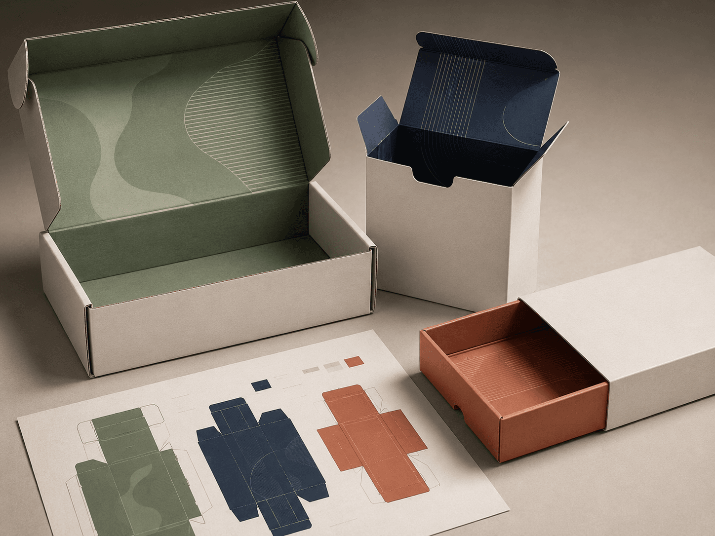
Adds colour inside mailers, rigid boxes or cartons for a more complete unboxing experience.
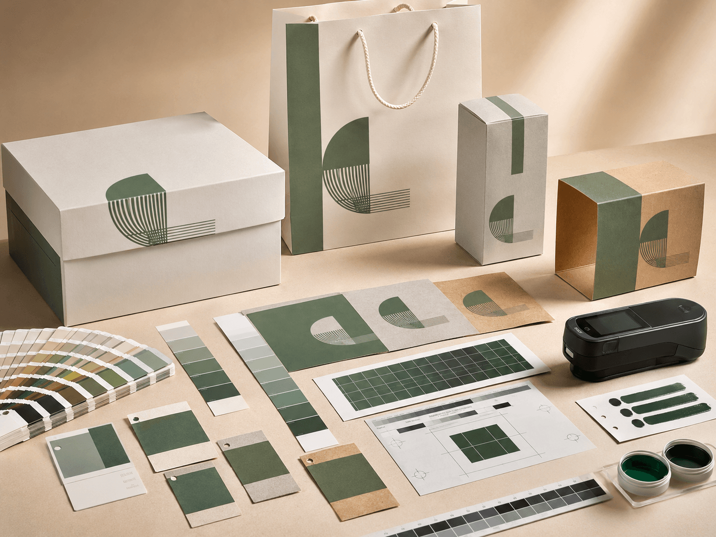
Review printed colour before production when brand accuracy or repeat orders matter.
Colour method should be chosen around brand accuracy, surface tone, artwork complexity and repeat order consistency.
| Colour Method | Best Use | Main Benefit | Practical Note |
|---|---|---|---|
| CMYK | Full-colour artwork | Flexible colour printing | Colours can shift by stock |
| Pantone | Brand colour matching | Stronger consistency | Best for defined brand colours |
| Rich black | Dark premium artwork | Deeper black appearance | Needs correct print specification |
| White ink | Kraft or coloured stocks | Better contrast | Not needed on every board |
| Inside colour | Unboxing moments | Adds a branded interior | Works well for mailers and rigid boxes |
| Colour proofing | Accuracy checks | Reduces print uncertainty | Recommended for critical colours |
Kraft, textured and uncoated stocks can make colour appear warmer or softer. A printed proof is useful when colour accuracy is important for brand consistency.
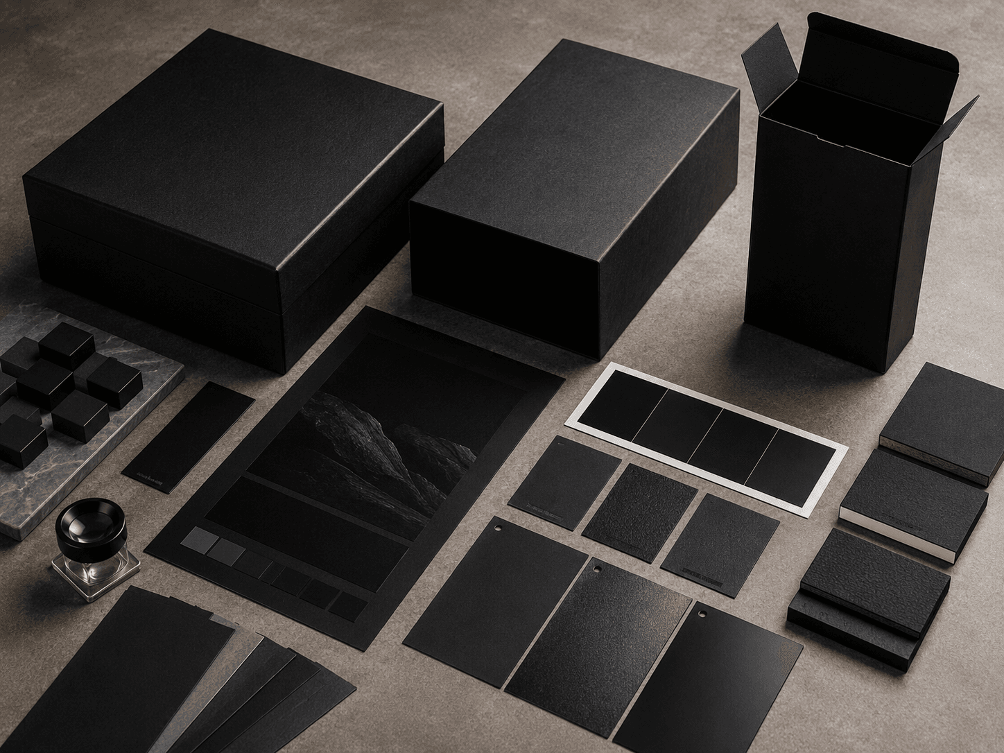
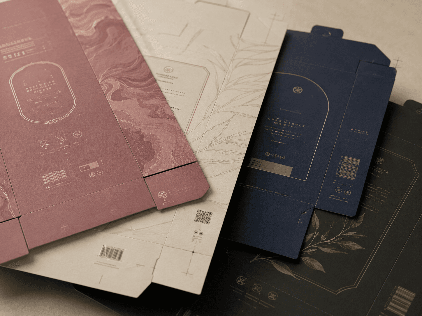
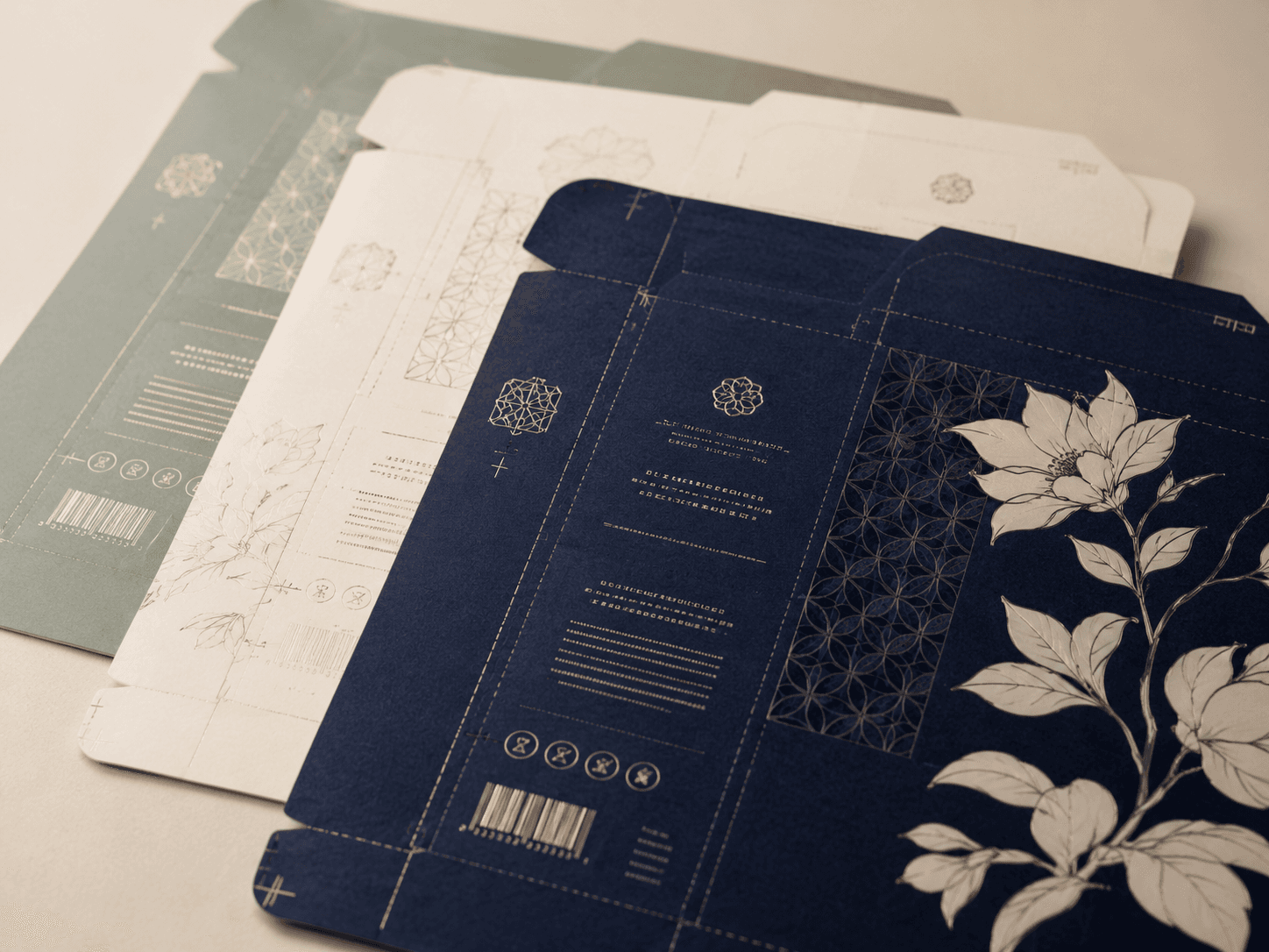
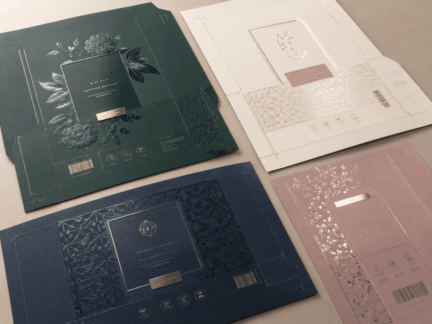
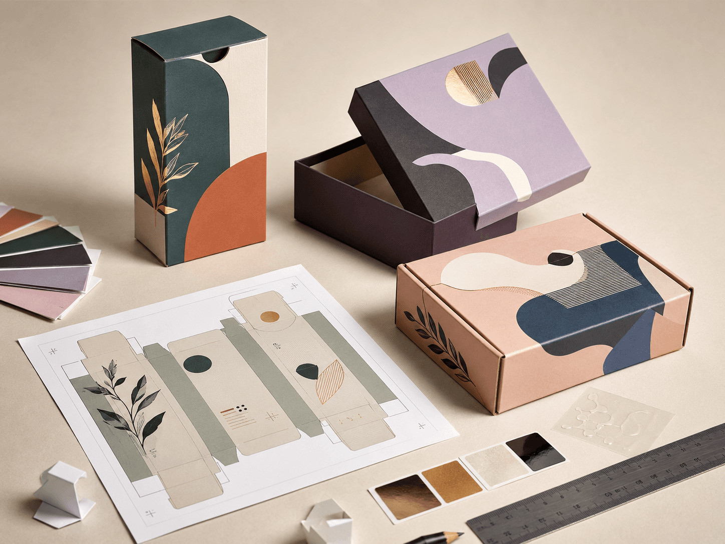
Finishes change how packaging looks, feels and handles. A calm matte surface, a bright gloss finish, a metallic foil detail or a raised logo can all shift the perceived value of the final packaging.
Soft, low-shine finish for refined packaging with a calm and premium surface.
Reflective finish that brightens colours and gives printed packaging a polished look.
Smooth tactile coating for luxury packaging, gifting and high-end retail presentation.
Practical water-based coating for added surface protection on selected paper packaging.
Surface treatment that can enhance print areas with controlled sheen or protection.
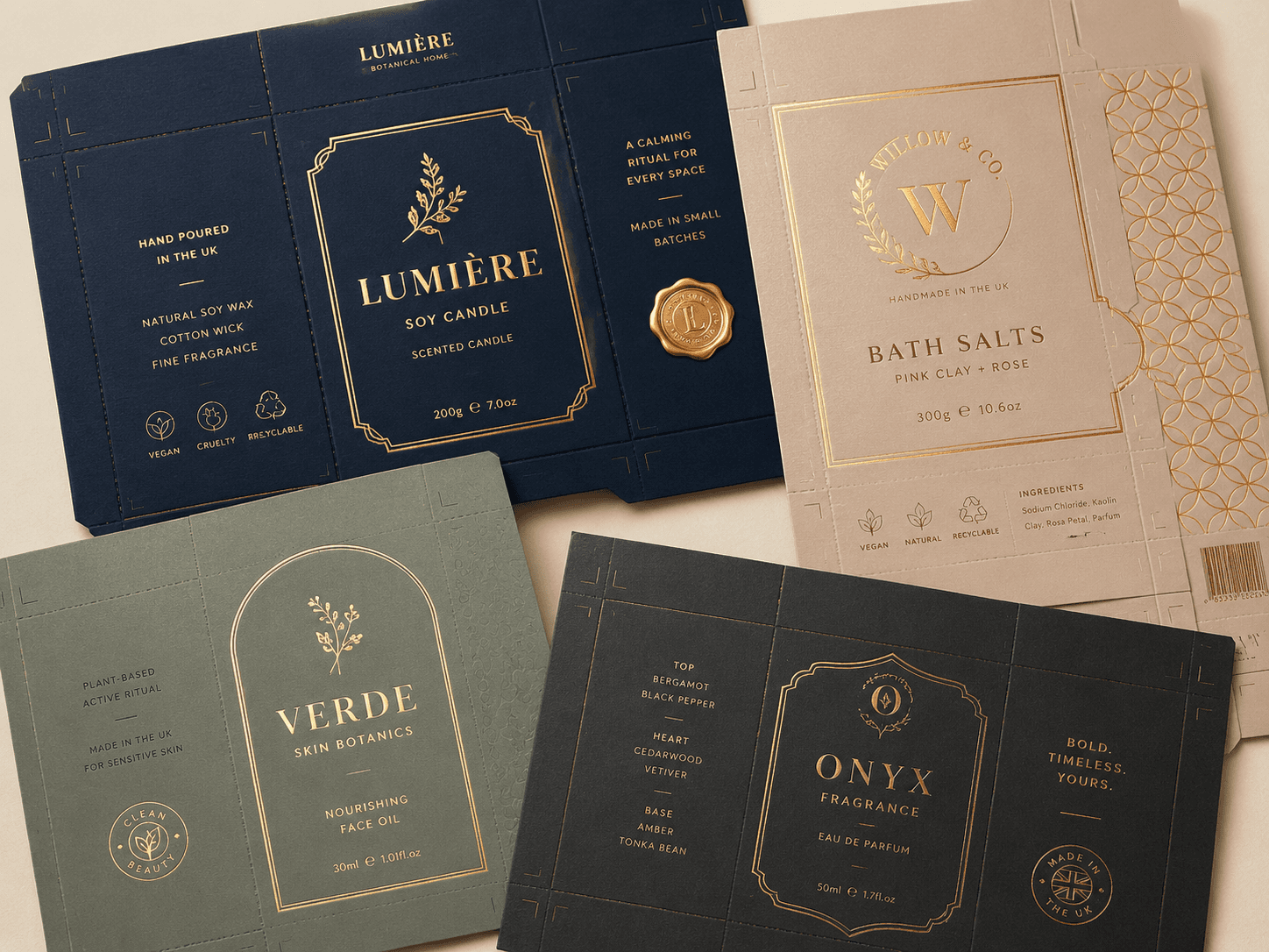
Metallic detail for logos, borders, patterns and premium product accents.
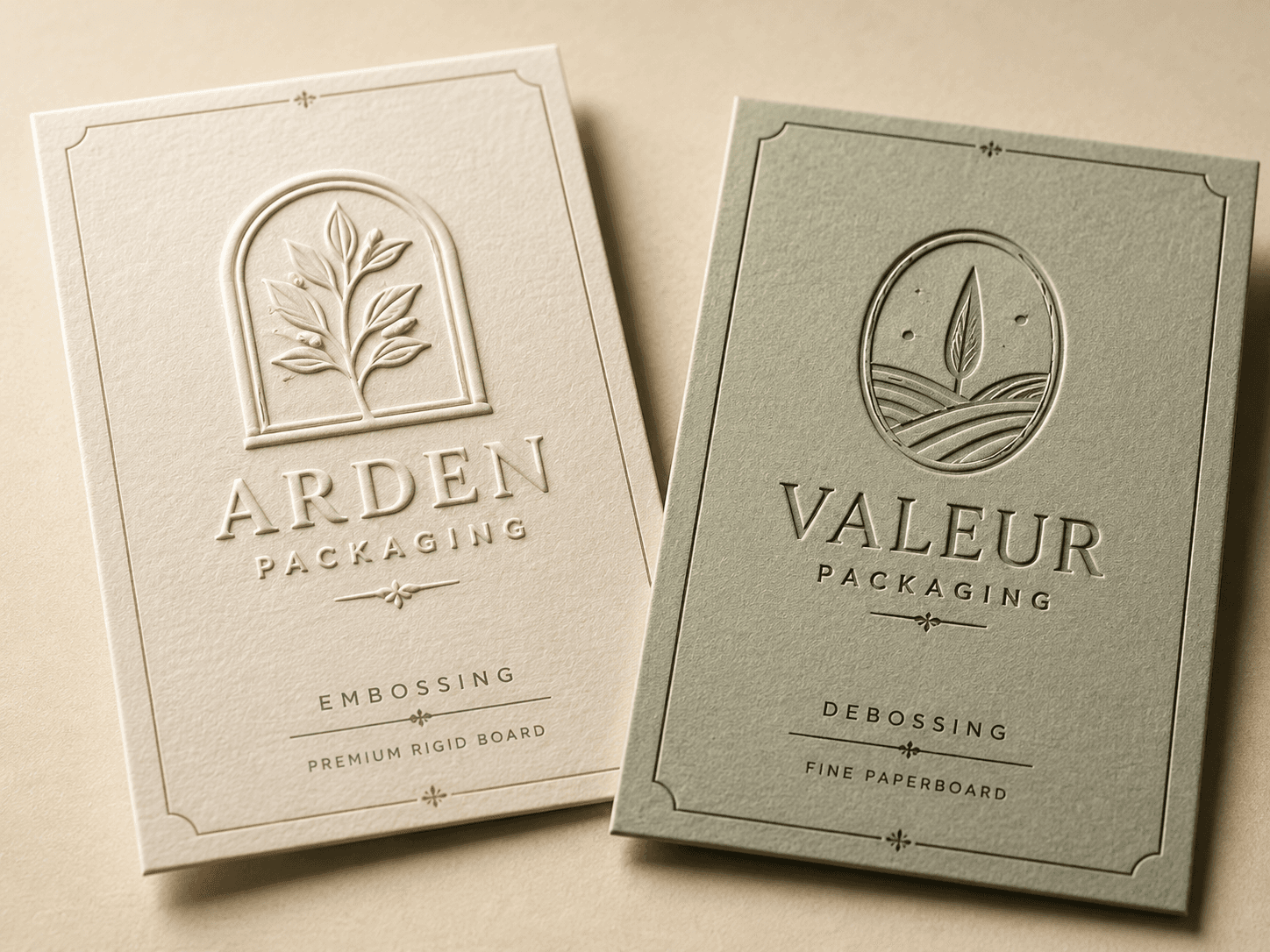
Raised or pressed details that add depth, texture and a more tactile brand mark.
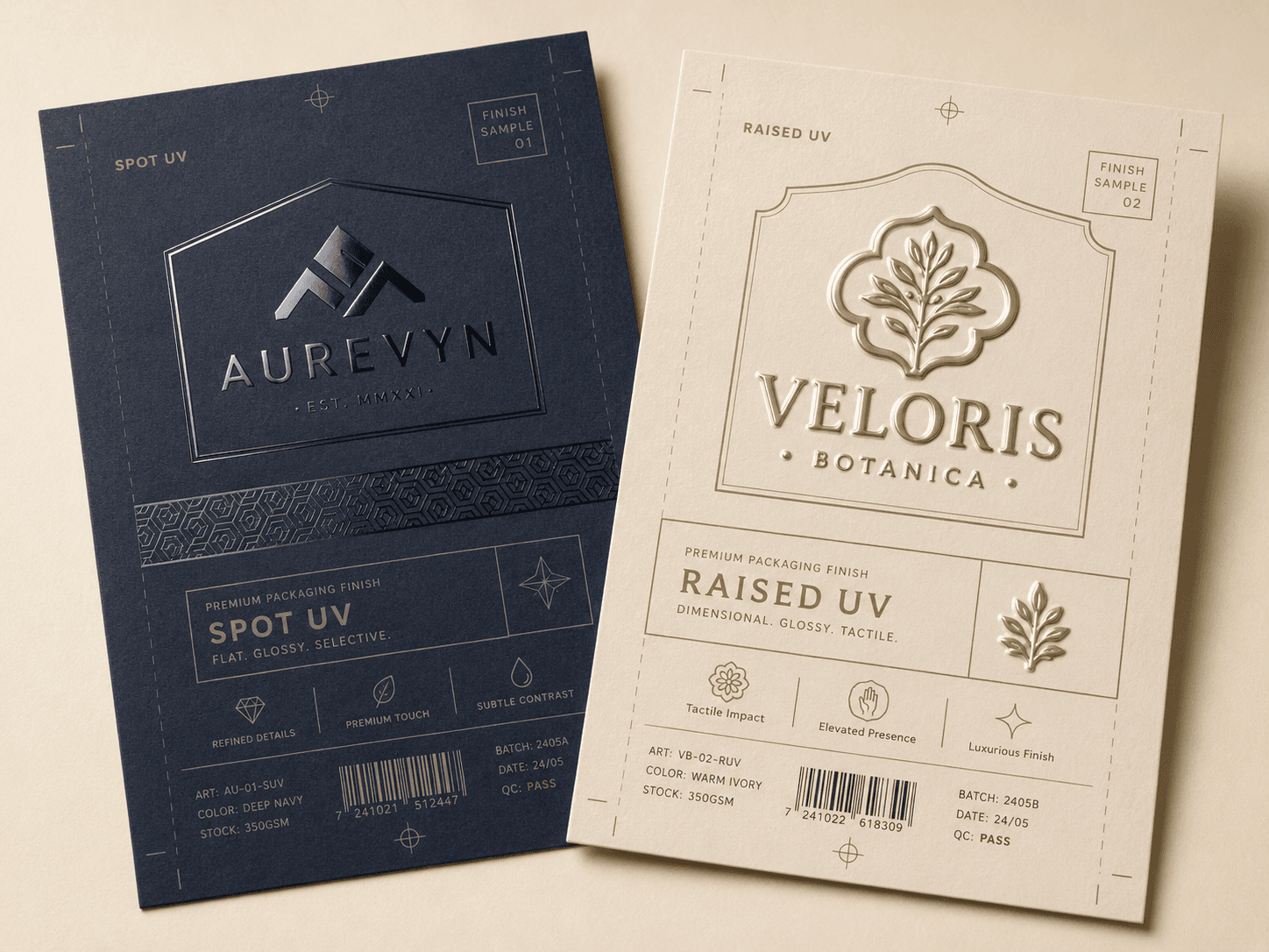
Gloss contrast on selected areas for logos, patterns, highlights and premium finishes.
Use finishes carefully. The best finish should support the product, artwork and board choice rather than overpowering the packaging.
| Finish | Visual Effect | Best For | Practical Note |
|---|---|---|---|
| Matte lamination | Smooth low shine | Luxury and minimalist packaging | Can soften colour intensity |
| Gloss lamination | Bright reflective surface | Bold colour and retail impact | Shows glare more clearly |
| Soft-touch | Velvety hand feel | Premium gifting and cosmetics | Works best on suitable stock |
| Aqueous coating | Light surface protection | Practical printed cartons | Less decorative than lamination |
| Varnish | Controlled sheen | Selected print enhancement | Can be subtle or glossy |
| Foil blocking | Metallic highlight | Logos and premium accents | Needs accurate placement |
| Embossing | Raised surface detail | Logos and tactile branding | Best on suitable board thickness |
| Debossing | Pressed surface detail | Minimal luxury effects | Works well with restrained artwork |
| Spot UV | Gloss contrast | Patterns and logo highlights | Strongest over matte surfaces |
Some finishes need smoother stock, enough board thickness or precise artwork placement. Confirm finish requirements early so the board, print method and dieline can support the final result.
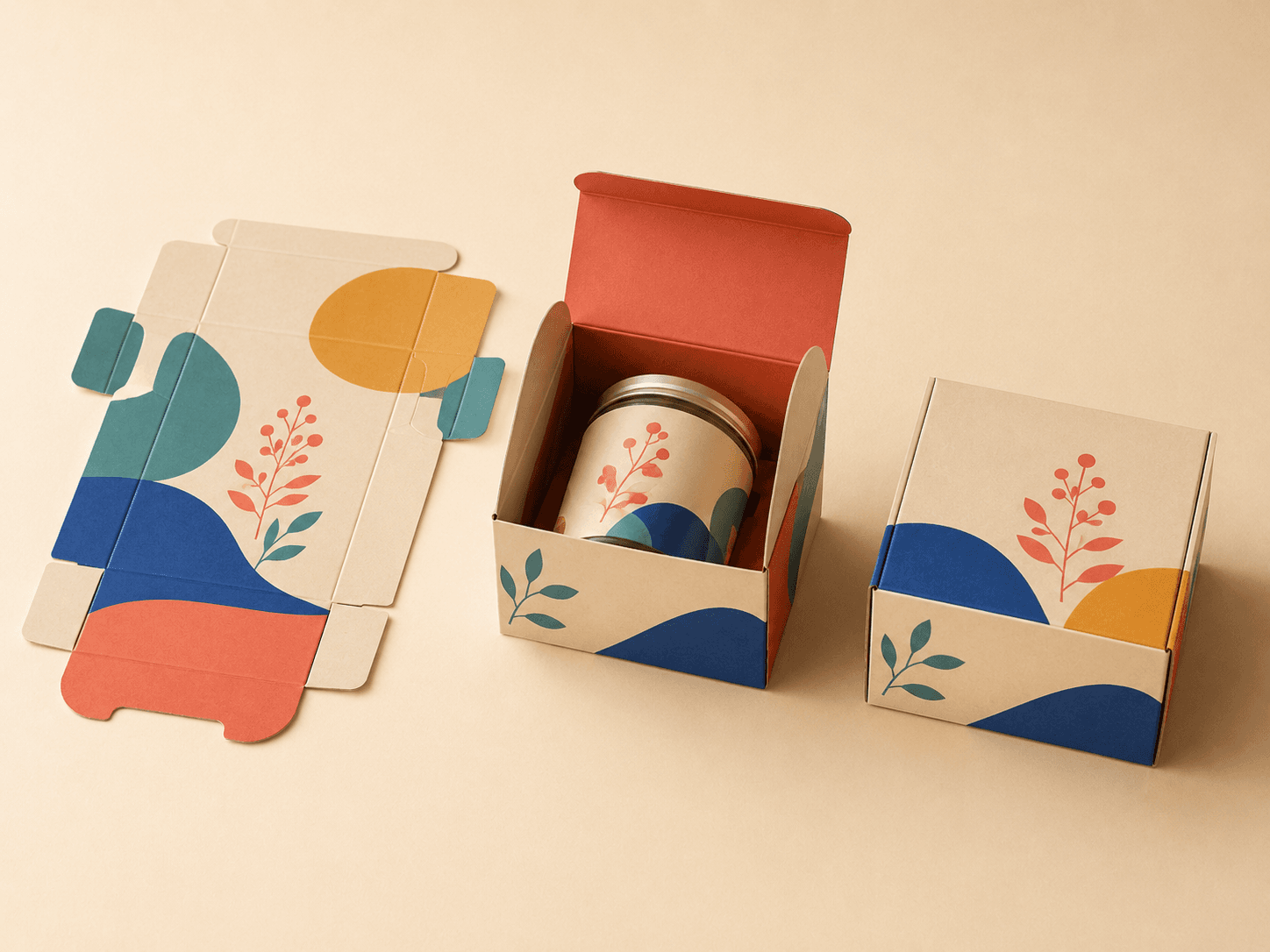
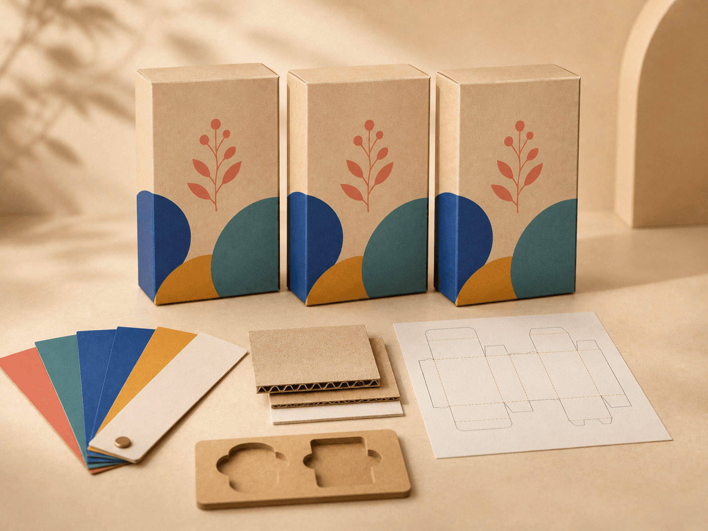
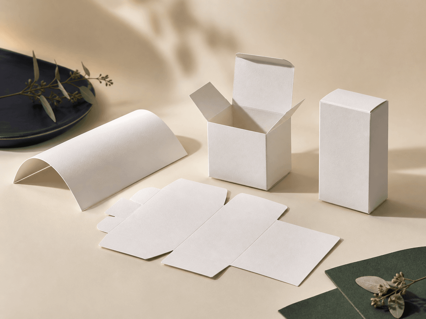
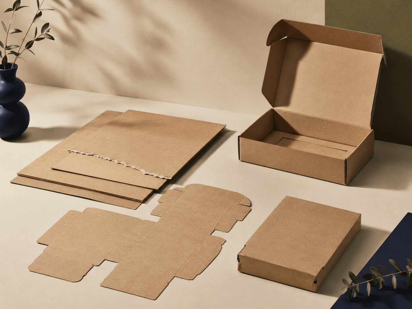
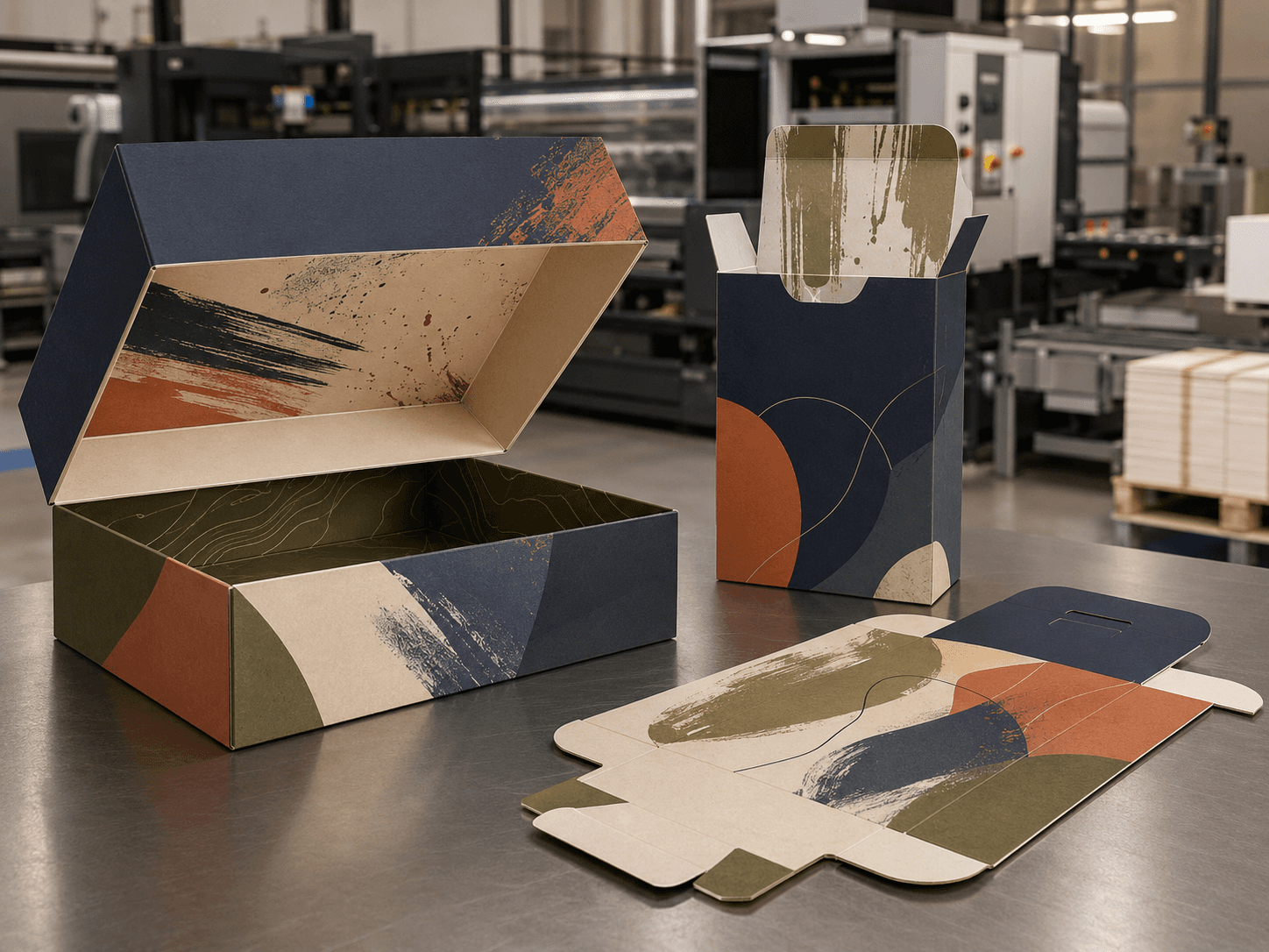
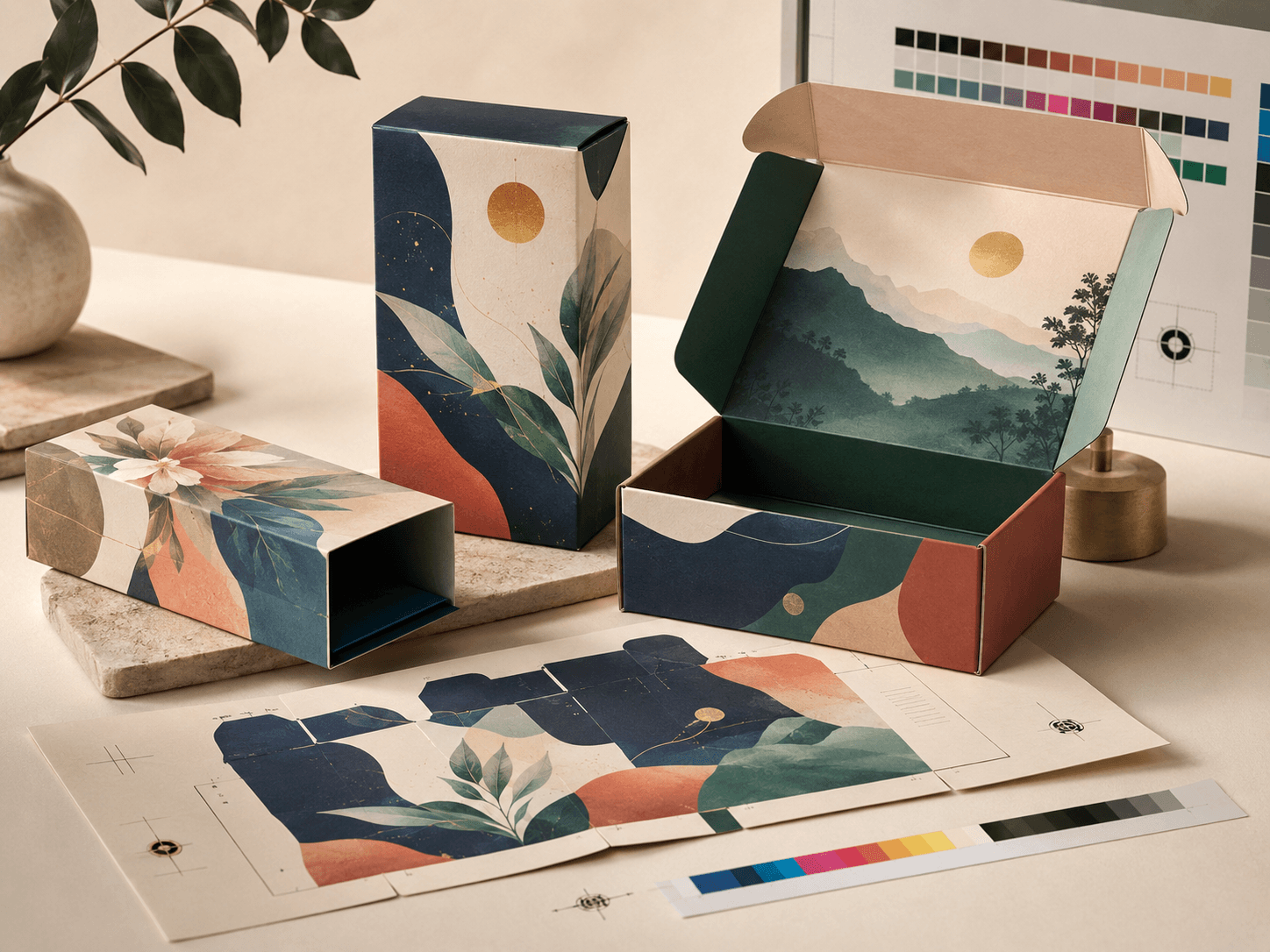
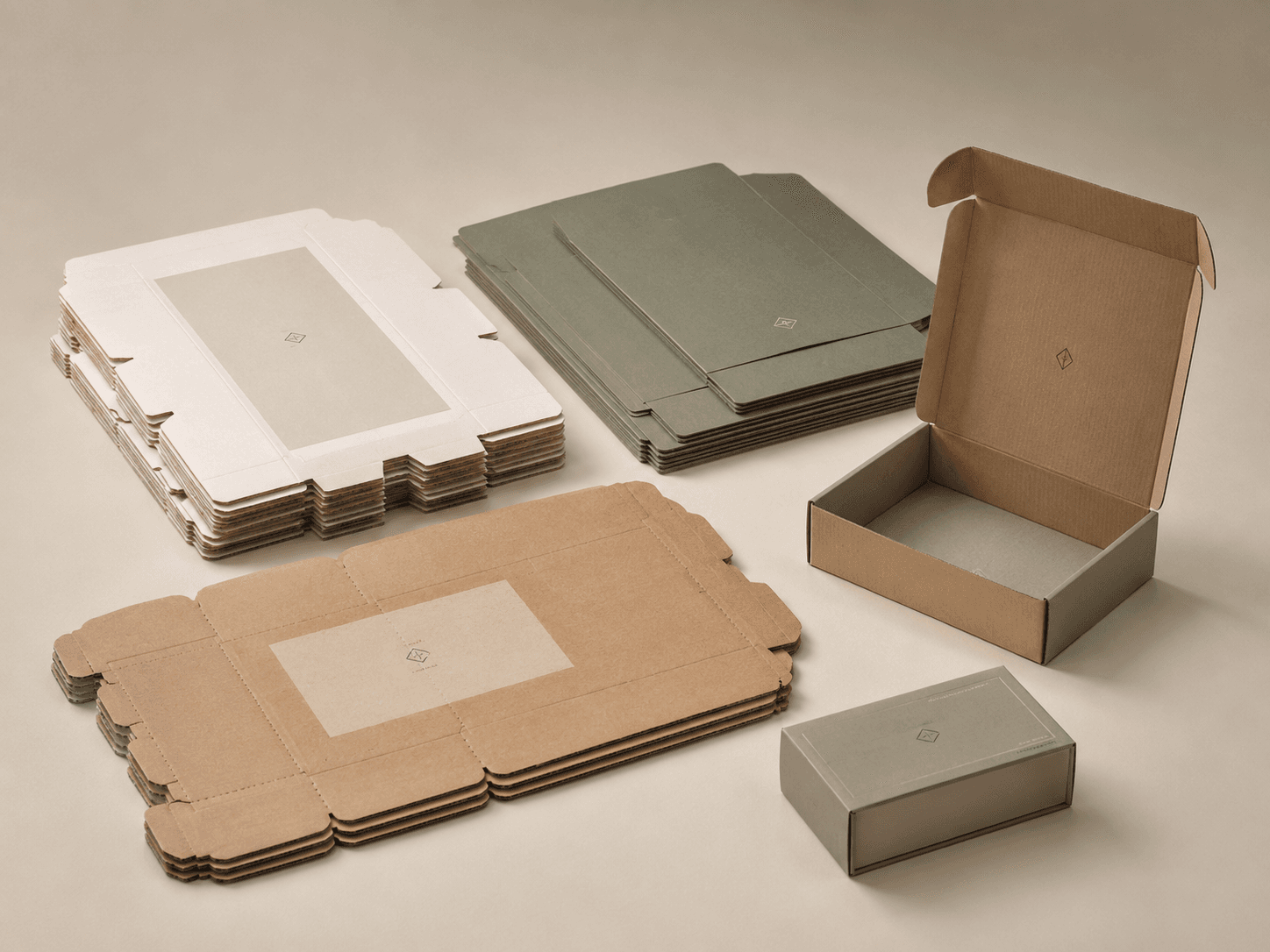
The structure decides how the packaging opens, folds, closes and protects the product. A clear dieline helps artwork sit correctly across panels, folds, glue areas and trim zones before production begins.
Set length, width and height around the product instead of forcing a standard box size.
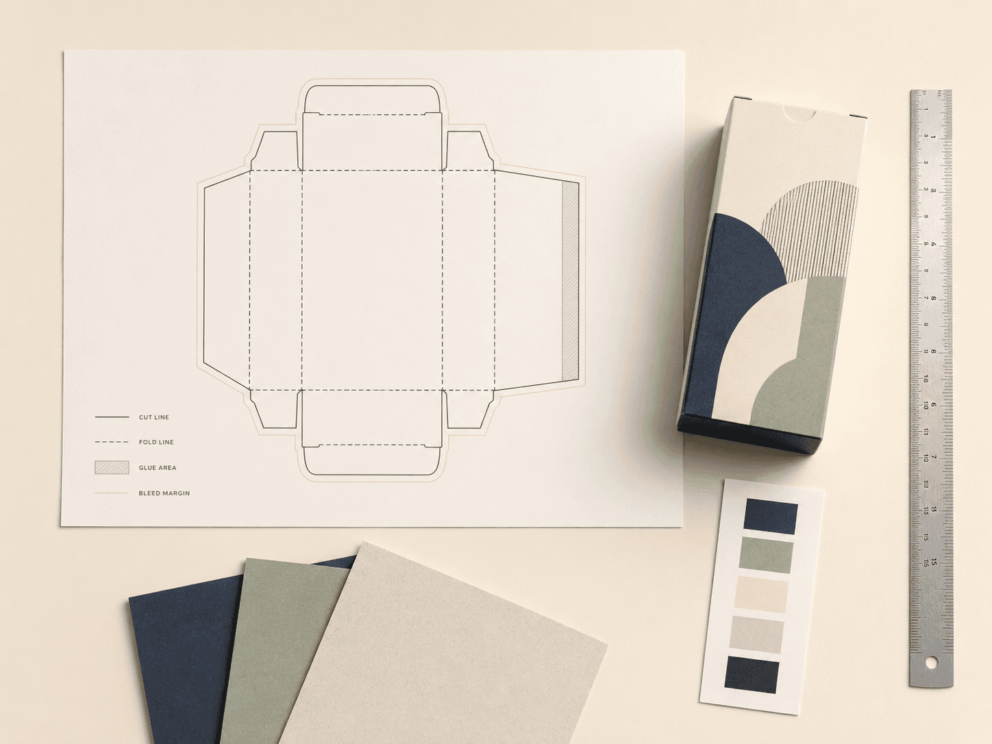
Create the flat artwork guide that shows panels, folds, cuts, glue areas and bleed.
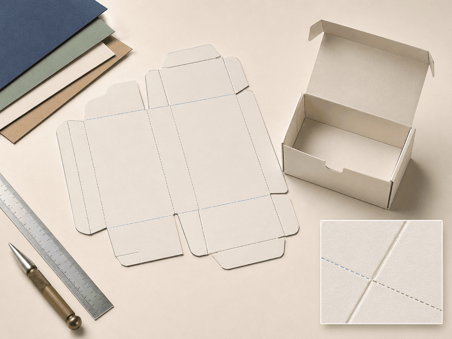
Plan crease positions so the packaging folds cleanly and holds its intended shape.
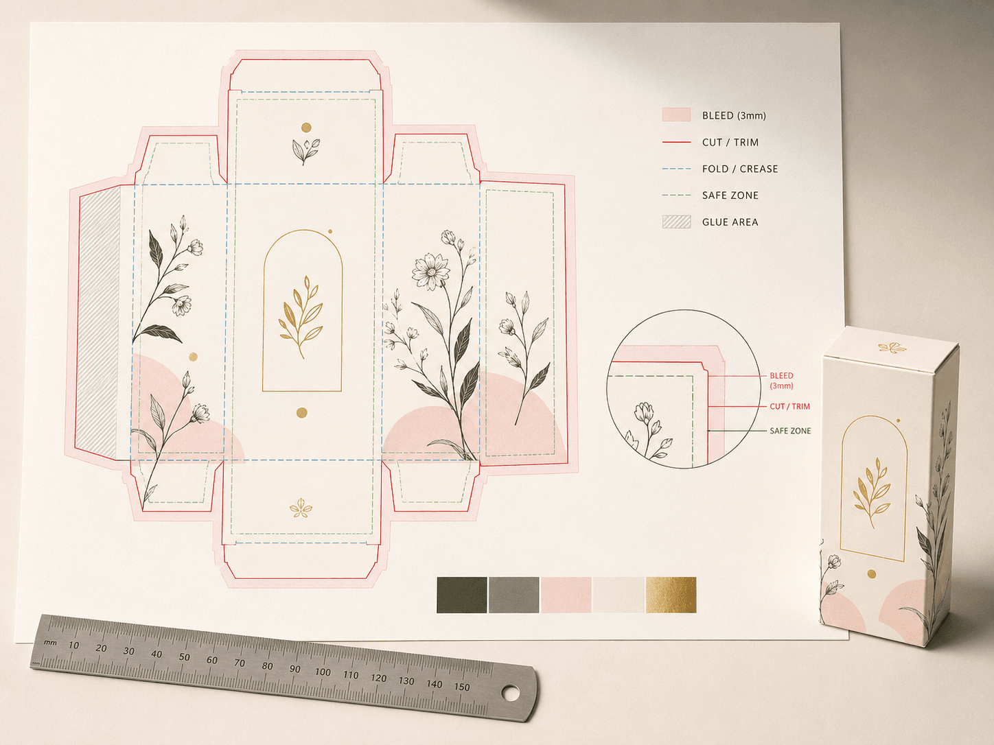
Keep artwork away from trim risks, fold edges and areas that may be glued or tucked.

Choose tuck, lock, sleeve, lid, drawer or magnetic openings based on use and presentation.
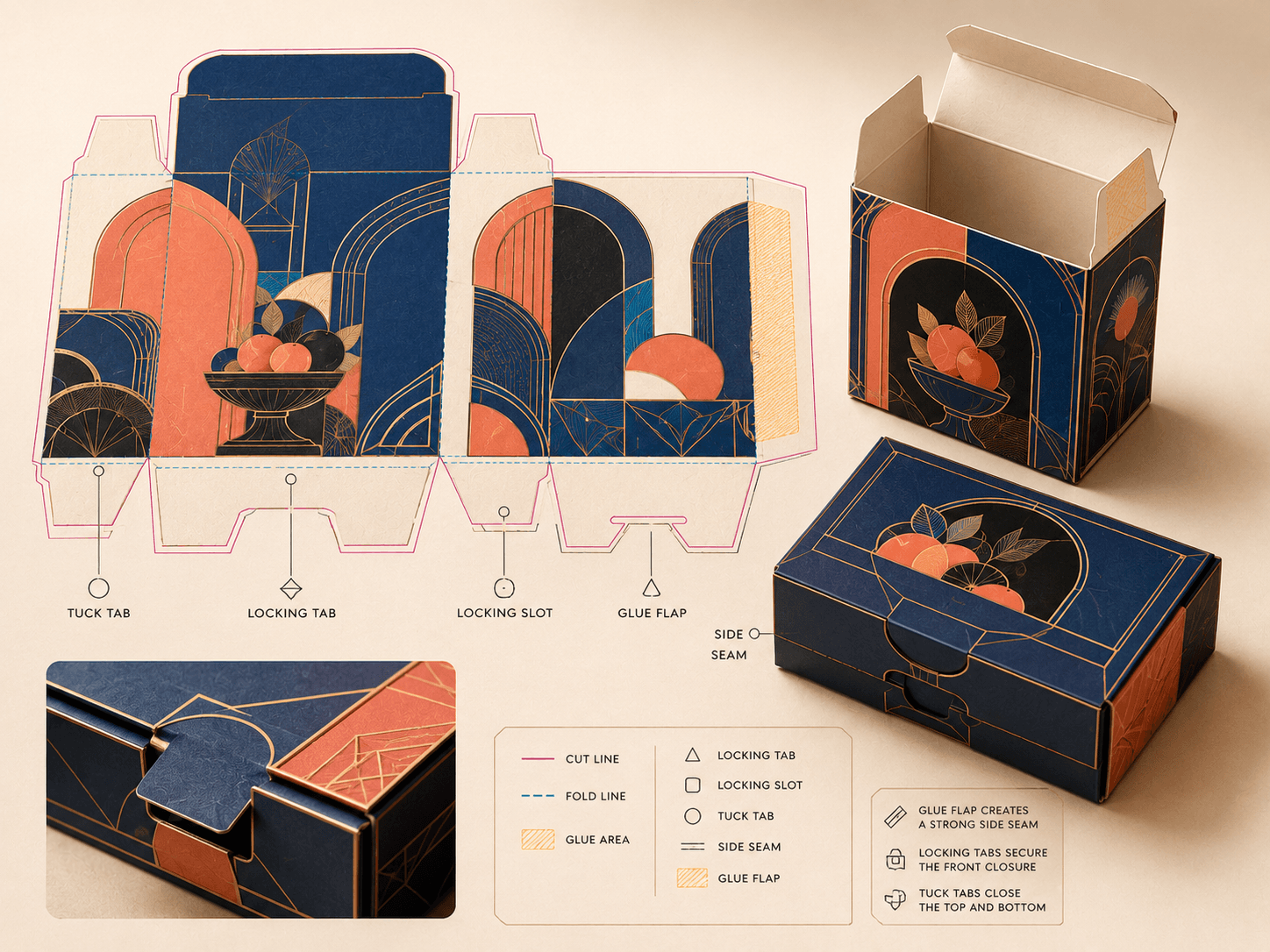
Plan structural connection points so the box assembles cleanly and stays secure.
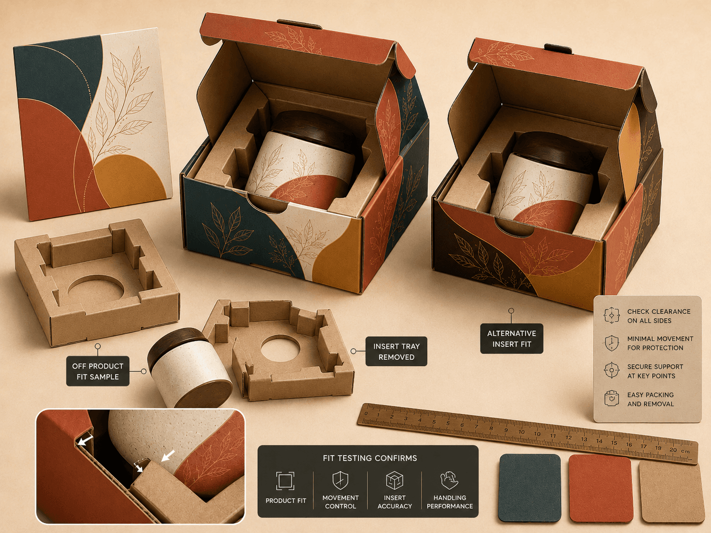
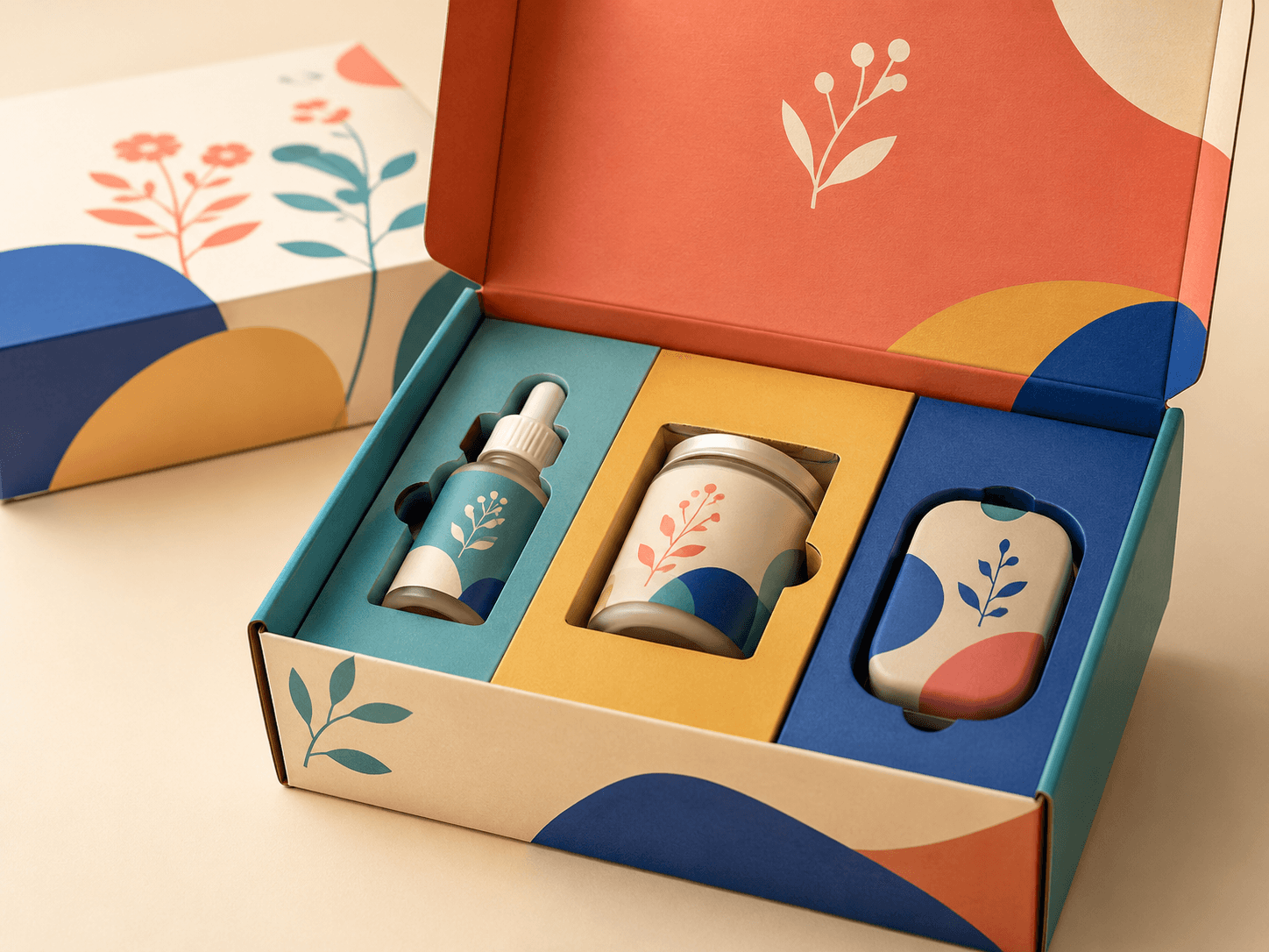
Check product fit, movement, insert spacing and handling before committing to full production.
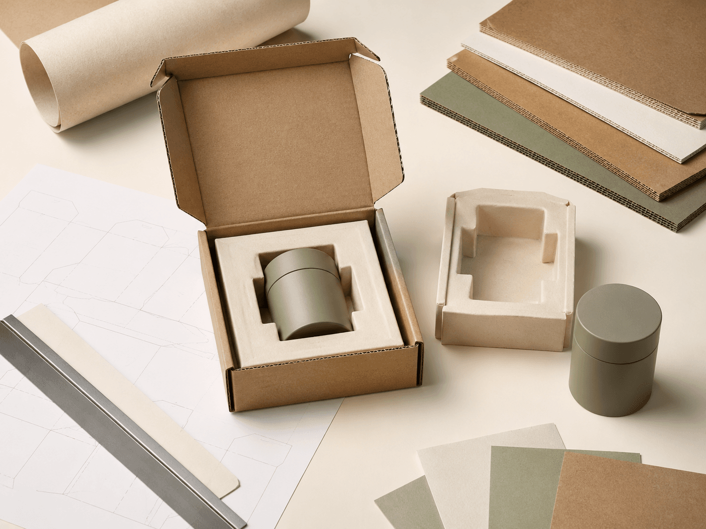
Internal packaging can be just as important as the outer structure. Inserts, dividers and pads help hold products in place, separate items, improve presentation and reduce movement during storage or delivery.
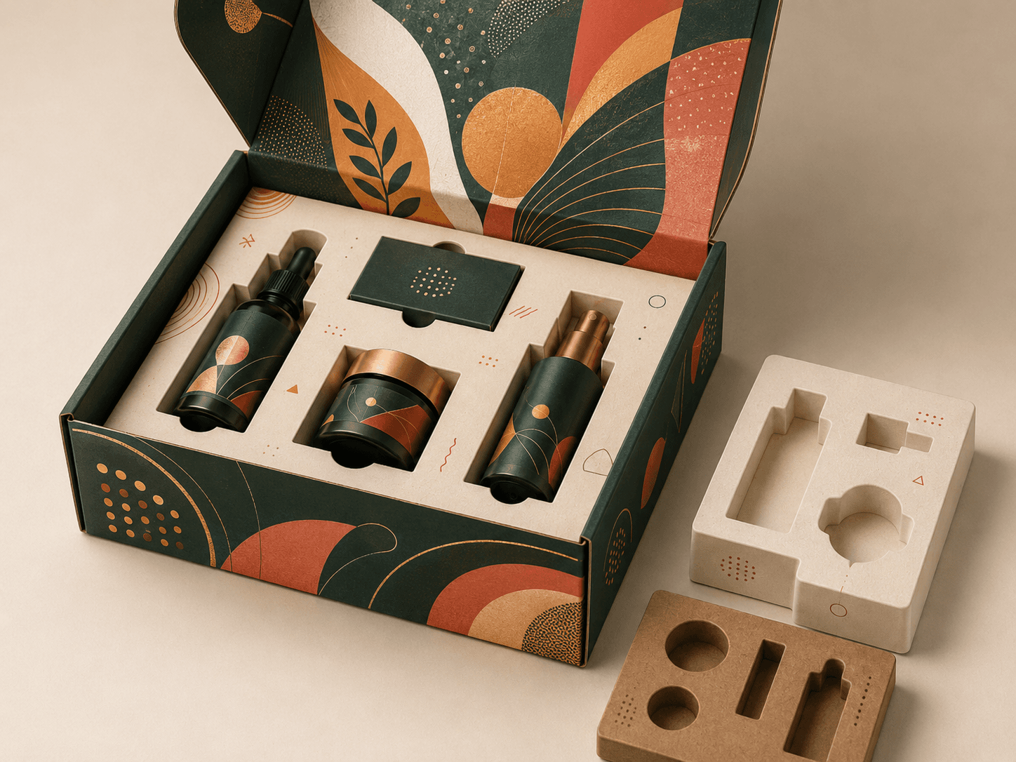
Paperboard inserts for product positioning, retail presentation and controlled unboxing.
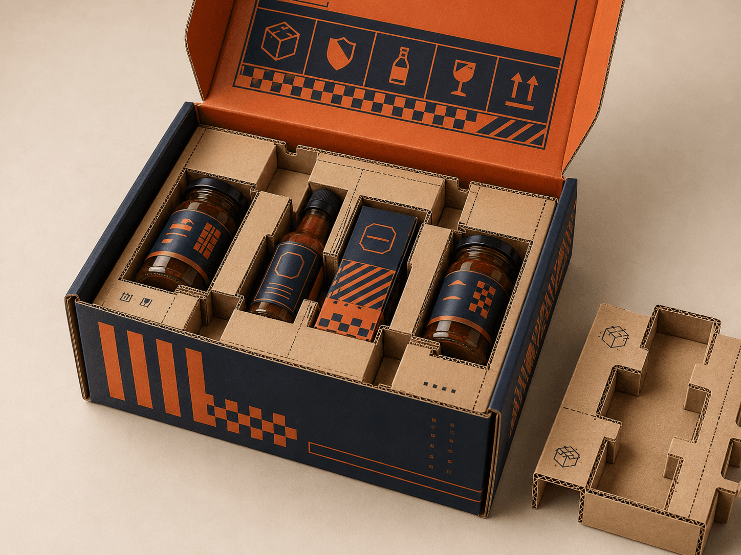
Stronger internal support for heavier items, ecommerce delivery and fragile products.
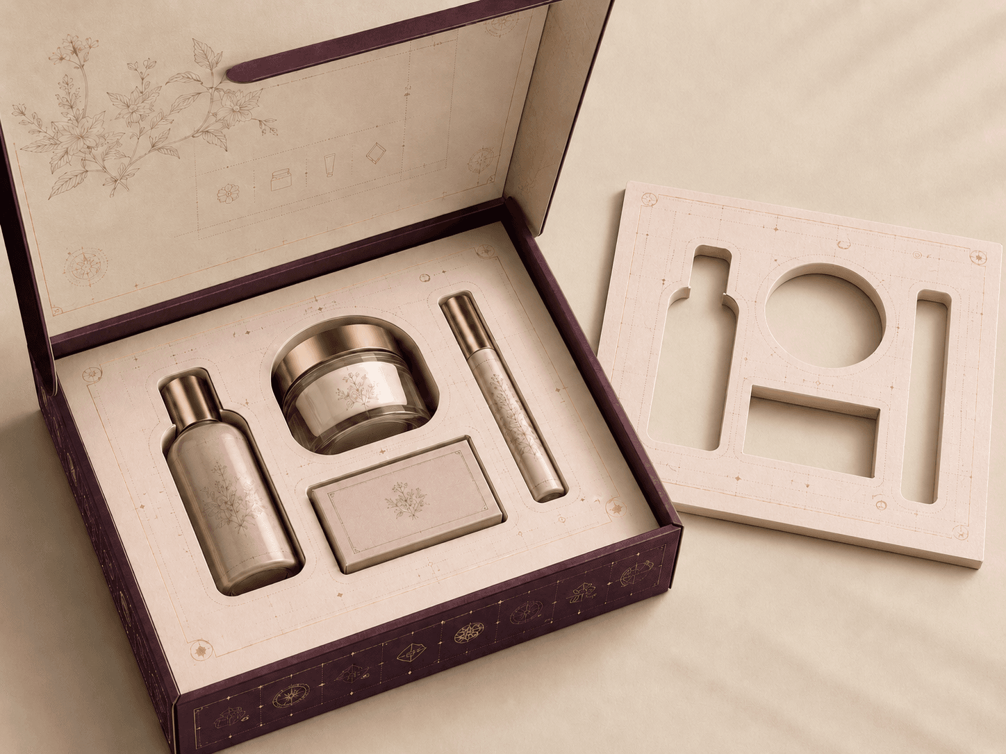
Precision-cut inserts shaped around bottles, jars, accessories, cosmetics or gift items.
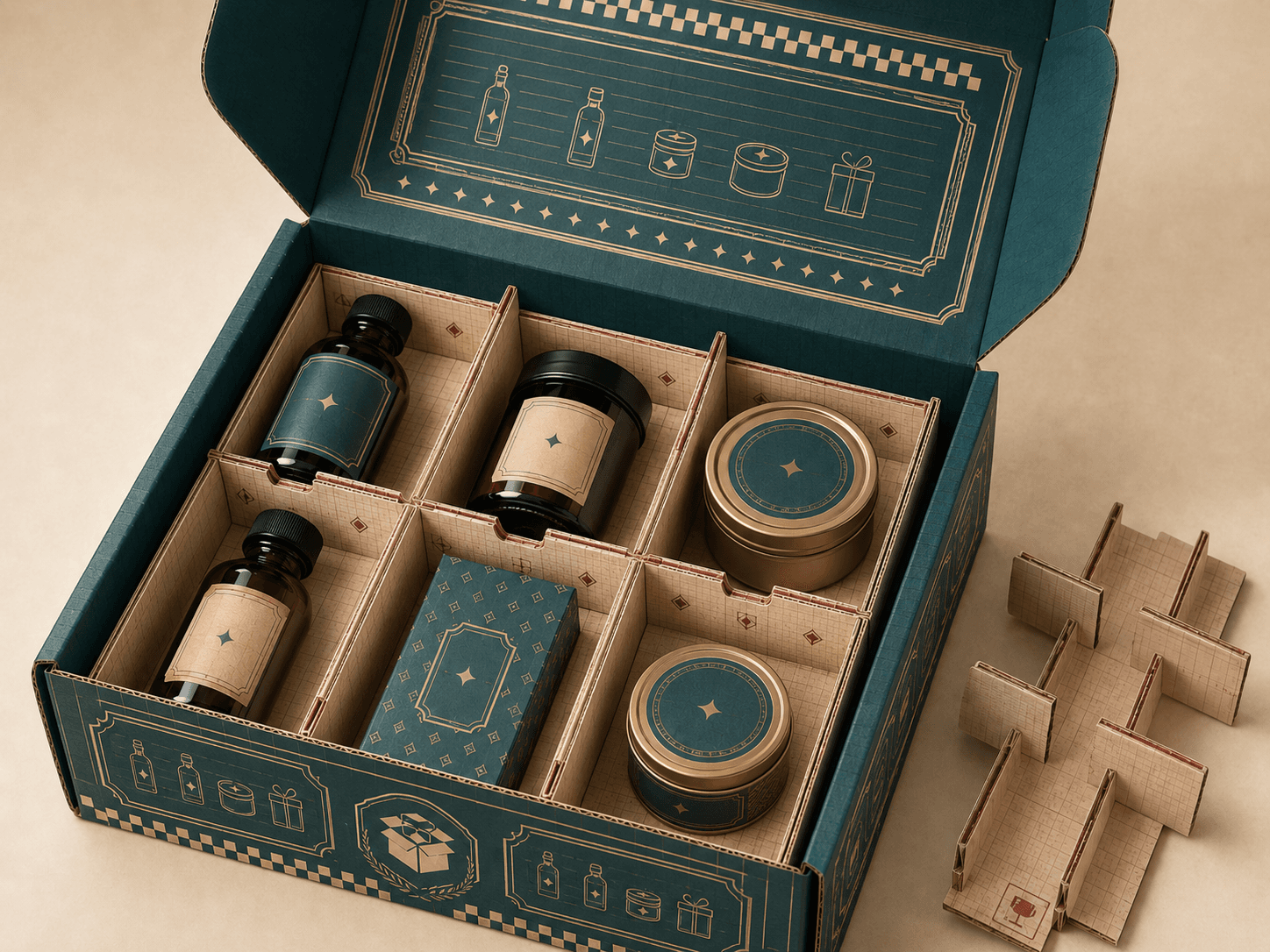
Internal dividers that separate products and stop items touching during handling.
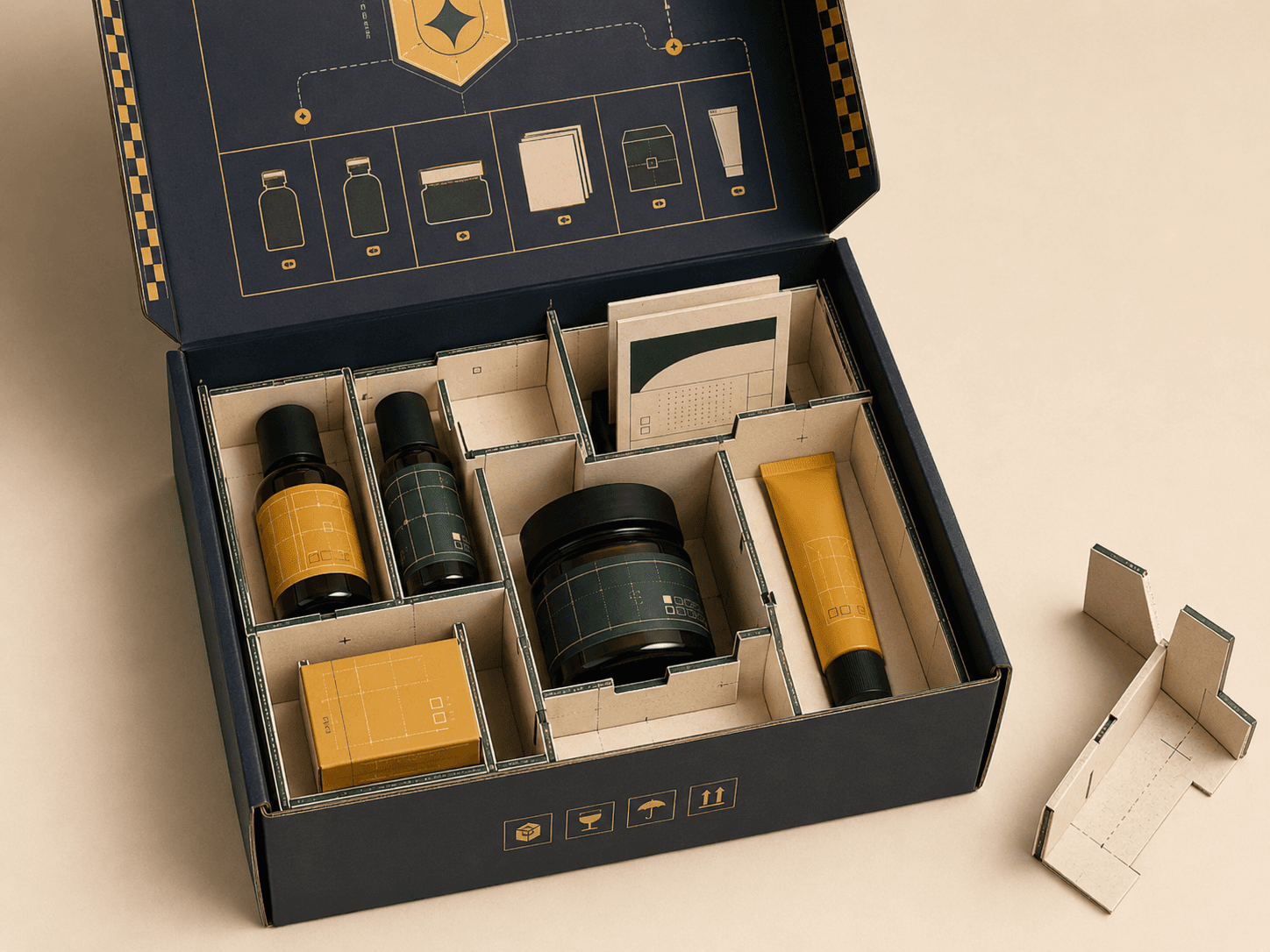
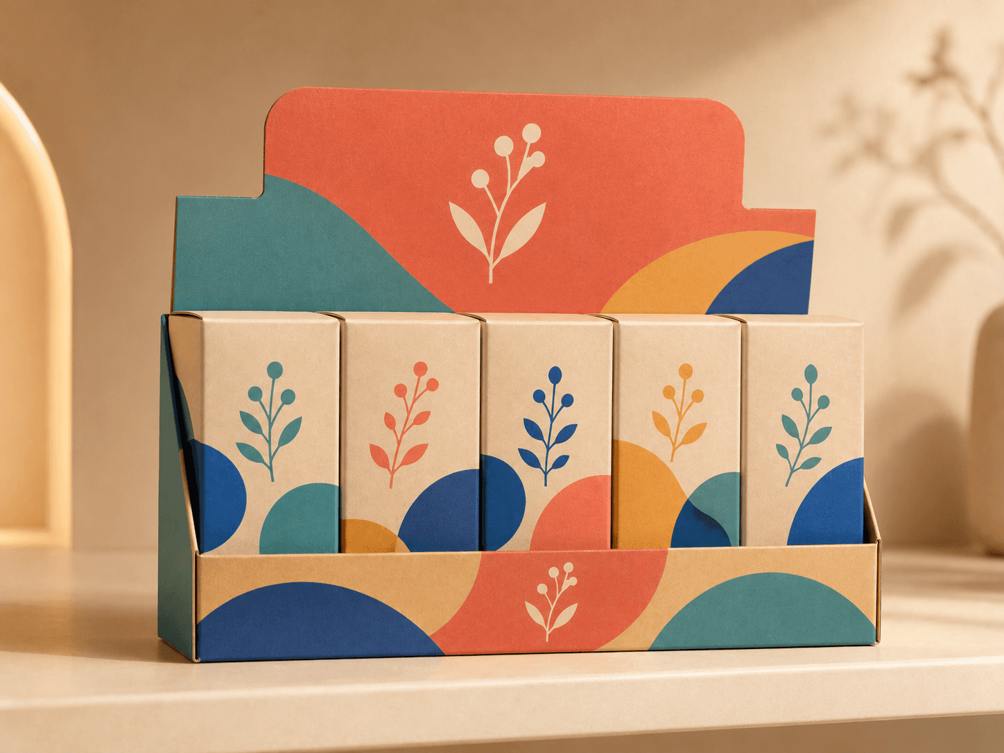
Multi-compartment layouts for organised packaging, product sets and grouped items.
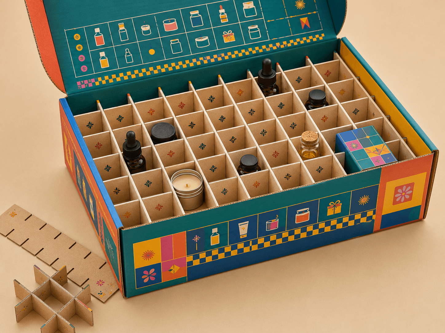
Grid-style divisions for small products, bottles, jars, samples or repeated units.
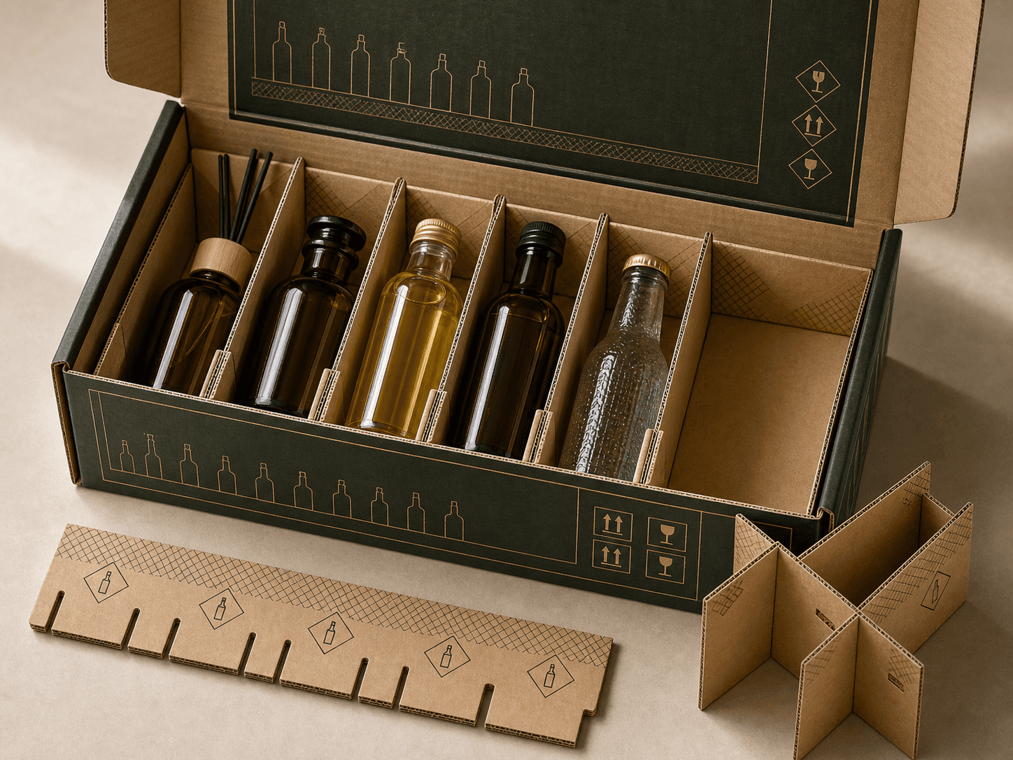
Protective dividers for glass bottles, diffuser bottles, drinks, oils or fragile containers.
Samples reduce uncertainty before production. A blank structural sample can confirm size, opening style and product fit while a printed prototype gives a clearer view of colour, finish, board feel and logo placement.
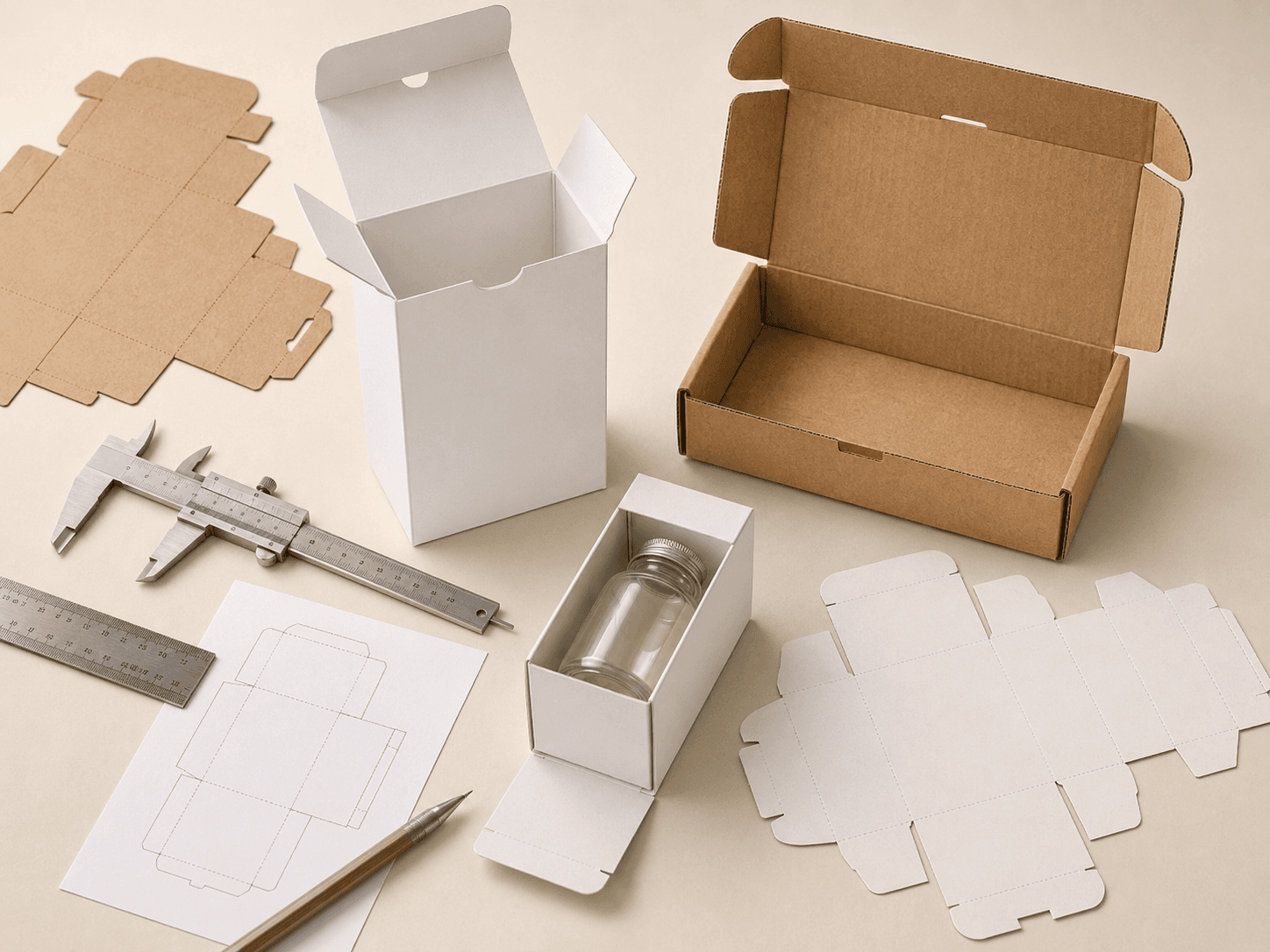
Check size, folding, closure and product fit before printing artwork.
Review artwork placement, colour, finish and overall presentation before production.
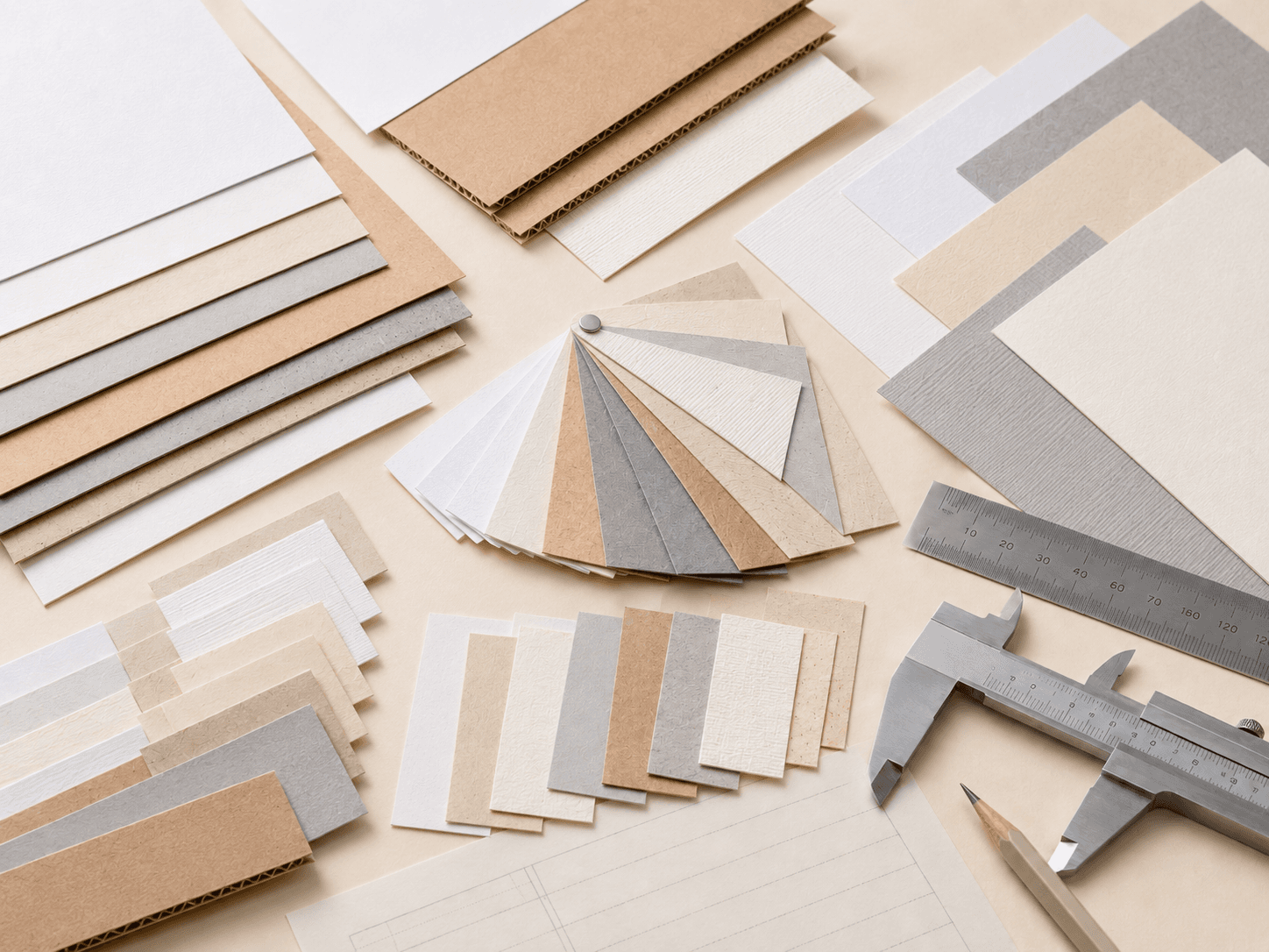
Compare thickness, texture, colour tone and surface feel across different board choices.
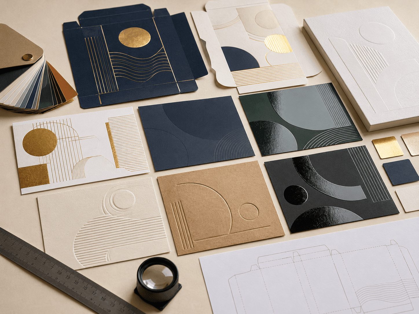
See how foil, lamination, embossing, debossing or spot UV looks on real stock.
Review important colour areas before final approval when brand consistency matters.
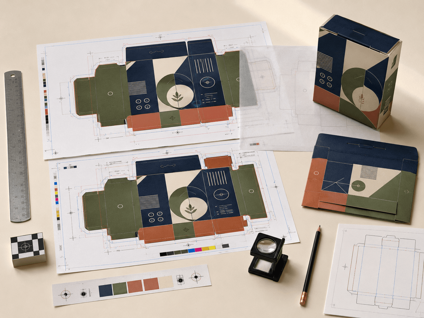
Check print-ready files, panel alignment, safe zones, bleed and dieline placement.
More responsible packaging often starts with better specification. Right-sized boxes, recyclable board choices, paper-based inserts and efficient flat storage can reduce unnecessary material without weakening the packaging.
Reduce empty space by matching packaging dimensions more closely to the product.
Use recyclable paper-based stocks where product needs and finish choices allow.
Choose natural or recycled paperboard options for a more understated material story.
Support products with cardboard inserts, dividers and cradles where suitable.
Improve product fit so less internal filling is needed during shipping.
Use flat-packed cartons, sleeves or mailers where storage and assembly speed matter.
Skincare Boxes, Makeup Boxes and Cosmetic Box Inserts often need refined print, accurate colour and clean presentation.
Donut Boxes, Cake Boxes and Chocolate Boxes need practical board, food-aware presentation and reliable handling.
Ring Boxes, Necklace Boxes and Jewellery Box Inserts benefit from rigid board, soft finishes and accurate internal fit.
E-commerce Mailer Boxes, Subscription Mailer Boxes and Fragile Product Mailer Boxes need corrugated strength and clean branding.
Candle Boxes, Candle Tubes and Reed Diffuser Boxes often need protective inserts and premium finishes.
Mobile Accessory Boxes, Charger Boxes and Electronics Mailer Boxes need accurate sizing, inserts and transit support.
A clearer specification helps the team recommend the right material, structure, print method and finish from the start.
Share your product size, quantity, preferred packaging style, artwork stage and finish requirements so the right board, print method, structure and production approach can be recommended. Whether you are planning retail packaging, ecommerce mailers, premium rigid boxes, paper bags, sleeves, tubes or inserts, the right specification will help the final packaging look better and work harder.