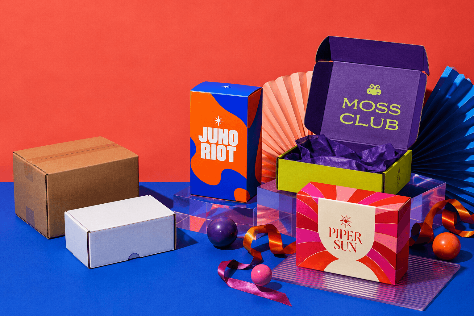
How Should You Handle Logo and Branding on Custom Boxes?
There is no single correct size, position or print treatment for a logo on a box. I make those decisions around four things: the product, the packaging structure, the sales environment and what the brand needs to communicate.
That sounds simple, but it rules out one of the most common mistakes I see in custom packaging: treating the box as a blank rectangle and dropping a logo onto it after everything else has been decided.
A logo may look perfectly positioned on a flat screen and fail once the box is cut, creased, folded and placed on a shelf. Small text may become unreadable. Social handles may be too faint to serve any purpose. A logo can sit too close to a crease. An oversized mark can consume so much of the main panel that the product name and other essential information have nowhere to breathe.
Good box branding has to survive production as well as look attractive in Illustrator.
My usual starting point is the centre of the main front panel. It is clear, balanced and easy to recognise. But I do not treat that position as a rule. If the packaging has a strong visual concept, the logo can move somewhere less conventional as long as the placement feels intentional and remains safely clear of structural lines.
The objective is not to put the logo in the most obvious place.
It is to make the whole package feel like the brand.
Start With Hierarchy Before Deciding Logo Size
One of the first questions people ask is: how big should the logo be?
I do not use a fixed percentage.
The correct size depends on what else the panel has to communicate and how the packaging will be seen.
A front panel might need:
If the logo takes 70% of the panel, everything else has to fight for the remaining 30%.
That can be appropriate for a deliberately logo-led concept, but it is rarely a good default.
When we work on custom boxes, I would rather establish the information hierarchy first and then size the logo within that hierarchy.
A Bigger Logo Does Not Automatically Create a Stronger Brand
Oversizing is one of the easiest ways to make good packaging feel less considered.
Large branding can work for a bold streetwear label, a playful food product or a product designed to be recognised from several metres away.
The same treatment can look clumsy on jewellery, skincare or a premium gift box.
Premium packaging often benefits from restraint. A relatively small logo with generous negative space can feel much more confident than a mark stretched from edge to edge.
My test is straightforward:
What should someone notice first?
What should they notice second?
What can wait until they pick the product up?
If the answer to all three is the logo, the hierarchy probably needs more work.
Put the Logo Where the Structure Can Support It
For a conventional carton, the centre of the main front panel is usually my first choice.
It gives the logo a stable visual position and keeps it easy to recognise in product photography, retail display and normal handling.
But centred does not always mean better.
An asymmetrical logo can work when another visual element gives the layout balance. A small mark near the upper part of a panel may suit a minimalist design. A logo can also become part of an illustration instead of sitting separately above it.
The important point is that an unusual placement should look intentional.
Never Crowd Creases, Cuts or Corners
This is where visual design has to respect manufacturing.
I do not place critical logos directly beside:
A crease is not simply another line on the artwork file. It is where the material is physically compressed and folded.
Corners also need room. Normal cutting, creasing and assembly tolerances mean artwork should not depend on every production operation landing with microscopic perfection.
For many conventional jobs, keeping important artwork roughly 3 to 5 mm clear of critical cuts and folds is a sensible starting point, but the final safe area should always follow the actual dieline and production specification.
If moving the logo a few millimetres destroys the entire composition, the composition is too fragile.
Design for the Place Where the Packaging Will Be Seen
The same logo should not automatically be treated the same way on every packaging type.
A retail carton is seen differently from an ecommerce mailer.
A gift box is handled differently from a counter display.
A subscription box creates a different branding opportunity from a carton hanging on a retail peg.
Retail Packaging Needs a Strong Primary Face
Shelf packaging often has to communicate quickly.
The logo must work alongside the product name, variant and whatever information helps someone identify the item.
A display box creates another consideration because part of the packaging may be obscured after products are loaded. Branding should be assessed in the stocked state rather than only on an empty dieline.
This is an easy detail to miss.
The empty display may look excellent in a mock-up while the products themselves cover the most important branding once it reaches the counter.
Ecommerce Gives You More Than One Branding Moment
With mailer boxes, the outside does not have to carry the entire brand story.
The exterior may need to survive handling, labels, stacking and delivery. The inside can create a cleaner visual reveal once the customer opens it.
I often prefer:
This gives each surface a job instead of printing every available panel simply because it can be printed.
Premium Structures Can Carry Quieter Branding
The construction itself contributes to perception on rigid boxes.
You already have thickness, sharper form and a different opening experience working in your favour.
That means the logo does not need to shout.
A smaller foil mark, blind deboss or carefully positioned embossed logo can carry more authority than a huge full-colour graphic.
Decide Whether the Logo Really Needs Full Colour
Brands often assume that their normal digital logo should simply be reproduced exactly as it appears on screen.
Sometimes that is the right decision.
Sometimes it is not.
A good brand identity should ideally have versions that can survive different production conditions, including:
A logo that only works in one perfect digital environment becomes difficult to use consistently.
When a One-Colour Logo Works Better
I like one-colour branding when simplicity improves reproduction rather than reducing identity.
It works especially well for:
It can also reduce visual competition when the product already has a lot happening elsewhere on the packaging.
One colour does not automatically mean basic.
A confident black mark on natural kraft or a single deep brand colour on clean white board can be more memorable than an unnecessarily complicated print.
When Full-Colour CMYK Is the Right Choice
CMYK becomes appropriate when the design depends on:
The important thing is to design for print rather than assuming RGB artwork will reproduce exactly as it appears on a bright monitor.
Screens produce colour with light.
Printed packaging uses ink interacting with a physical surface.
Some vivid RGB colours cannot be reproduced exactly in ordinary CMYK. Neon-like greens, intense blues and highly saturated colours are common problem areas.
If the identity relies heavily on a particular colour, I want that issue identified before production rather than after several thousand boxes arrive.
The choice between process and spot colour also depends on the print method. I cover that distinction in more depth when looking at digital vs offset printing for packaging.
Use Pantone When Colour Consistency Justifies It
Pantone can be useful when a specific brand shade needs tighter control from one production run to another.
I consider it especially relevant when:
Pantone is not automatically superior to CMYK.
It solves a different problem.
Material also changes the result. The same ink will not necessarily look identical on coated white paperboard, uncoated stock and brown kraft.
That is why I treat colour as ink plus substrate, not just a number in a design file.
White Ink Can Give Dark and Kraft Packaging More Control
White ink can be extremely effective on natural kraft or dark material.
On kraft, it can create a strong clean mark while leaving the board itself visible as part of the design.
On black, navy or deep green stock, it can create a high-contrast minimalist identity without introducing unnecessary colour.
White ink can also act as an underprint in certain production methods when selected colours need more separation from the underlying material.
The result depends heavily on ink opacity, material and print process, so this is an area where a physical proof or sample can be more useful than relying on a screen alone.
Use Foil When the Reflection Has a Purpose
Metallic foil can create something normal CMYK ink cannot: actual reflected light.
Gold, silver, rose gold and holographic foils can make a logo behave differently as the package moves.
I like foil most when it has one clear job.
A small foil logo against a matte surface can create a stronger premium impression than using metallic detail across half of the box.
This is also where artwork complexity matters.
Extremely fine lines, tiny gaps and delicate scripts may need adjustment before foil production. Something that looks beautiful as a vector path at 400% zoom is not automatically suitable for hot stamping at physical size.
The available print and finishing options should be chosen around the design rather than added afterwards as decoration.
Embossing and Debossing Need Artwork With Enough Weight
Embossing raises the surface.
Debossing presses it inward.
Both can turn the logo into a tactile part of the packaging instead of relying entirely on ink.
I particularly like these treatments for simple symbols, wordmarks and bold typography.
Very delicate artwork needs more care because the physical process has limits. Fine strokes and tiny counters can lose definition.
Blind embossing or debossing, where no additional ink or foil is used, can work exceptionally well when the brand wants a restrained mark.
This is a good example of branding becoming stronger by removing something rather than adding something.
Spot UV Should Reveal Something
Spot UV creates the most impact when the gloss contrasts clearly against a matte or lower-sheen surface.
It can work well on:
I do not like applying Spot UV simply because it is available.
If the whole design is fighting for attention, the finish loses its purpose.
The gloss should reveal or emphasise something.
It should not become visual noise.
Contrast Matters More Than the Name of the Colour
A brand colour can be technically correct and still fail on packaging.
Medium grey printed over kraft is a simple example. The digital artwork may look refined on a bright monitor. On brown material, the distinction between the two tones can become too weak.
Similar problems occur with:
If the logo becomes difficult to recognise from a normal viewing distance, the fact that its colour value is technically correct does not rescue it.
Legibility comes first.
Small Text Can Destroy Otherwise Good Packaging
Social handles, URLs, taglines and secondary messages often get squeezed into whatever space remains.
I see this frequently.
The main branding looks excellent, but the Instagram handle is so small that nobody can read it. A short website address sits too close to the fold. White legal copy begins filling in against a heavy dark background.
At that point, the information is taking up space without doing its job.
As a practical starting point, I am cautious about positive text below roughly 6 pt and knockout or reversed text below roughly 8 pt.
Those numbers are not universal production rules.
A fine serif at 8 pt can perform worse than a heavier sans serif at 7 pt. The substrate, print method, ink coverage and typeface all matter.
I check the actual strokes and counters at physical size rather than approving text simply because the design software reports an acceptable point size.
Start With the Dieline, Not the Finished Artwork
This is one of the strongest opinions I have about packaging design.
Lock the packaging structure before finalising the artwork.
A dieline determines the physical geometry of the box:
Once the structure has been approved, the artwork should adapt to it.
The dieline should not be stretched because a designer decided the logo needed another 10 mm.
If you already know your dimensions, the free box dieline generator can produce a useful starting template for several box structures.
For the production logic behind cut lines, folds, bleed, safe areas and artwork orientation, I have also broken down packaging dielines and box artwork setup in detail.
Never Move Structural Lines to Rescue the Design
This is a surprisingly common mistake.
Someone designs the branding first.
Then the actual dieline arrives.
The logo does not fit the proportions they imagined, so the designer moves a fold or stretches a panel.
That is backwards.
Changing structural geometry can affect:
Change the graphics.
Do not casually change an approved structural template.
A PDF or AI File Is Not Automatically a Vector Logo
One of the recurring artwork problems I see is what I call a fake vector.
Someone takes a small JPEG logo, places it inside Adobe Illustrator and saves the file as .ai or .pdf.
The file format changed.
The logo did not.
It is still made from pixels.
Enlarge it enough and the edges will still become soft or jagged.
A genuine vector logo is built from scalable paths and shapes. It can be resized without turning the edges into visible pixels.
This matters more on packaging than many people expect because the same logo might be 20 mm wide on one carton and 150 mm wide on another.
Always inspect what is actually inside the file rather than trusting the extension.
Outline Fonts Before Final Production When Required
Fonts create another avoidable failure point.
If the printer opens editable artwork without the exact typeface installed, text can substitute or reflow.
A different font may change:
For final production artwork, I normally want fonts handled according to the printer's workflow, which often means converting final typography to outlines.
Keep an editable master file separately.
Once text has been outlined, ordinary copy editing becomes much less convenient.
Give Background Artwork Enough Bleed
A coloured background that stops exactly at the trim line is asking for trouble.
Cutting has tolerances.
If the blade lands slightly away from the theoretical trim position, an unwanted strip of unprinted material can appear at the edge.
Extending backgrounds and images beyond the cut line gives production enough room to trim cleanly.
Around 3 mm of bleed is common for many packaging jobs, but the final value should always come from the approved production specification.
Do not invent your own bleed because another printer used it on a previous job.
Keep Important Artwork Inside the Safe Area
Bleed protects artwork that intentionally runs off the edge.
The safe area protects artwork that must remain visible.
Logos, URLs, social handles, product names and critical text should sit comfortably inside that safe area.
This distinction matters:
Bleed goes beyond the cut.
Critical information stays away from the cut.
Confusing those two areas is one of the quickest ways to create artwork that looks acceptable on screen and poorly positioned after production.
Use Sufficient Resolution for Raster Images
Logos should ideally be vector where possible.
Photographs and other pixel-based imagery are different.
For conventional high-quality print, around 300 ppi at final reproduction size is a common working target.
The phrase “at final size” matters.
A photograph may technically be 300 ppi when placed at 50 mm wide and become effectively much lower resolution after someone enlarges it to cover a 200 mm panel.
Do not judge resolution only by how sharp an image looks on a phone or laptop.
Treat QR Codes and Barcodes as Functional Elements
QR codes and barcodes are not ordinary decorative graphics.
They have to work.
For linear retail barcodes, dark bars on a light background are generally the safest approach, with black on white providing particularly dependable contrast. The correct quiet zones must remain clear.
Do not place codes:
QR codes also need enough contrast and clear space around them.
Test them at approximately the actual printed size.
Do not approve a QR code because it scans when displayed at 200 mm wide on a computer monitor if it will eventually be printed at 15 mm.
Separate Foil, Spot UV and Other Finish Artwork Properly
Special finishes need production information that ordinary CMYK artwork does not provide.
Foil, Spot UV, white ink, embossing and debossing normally require their own clearly identified vector artwork or spot layers according to the printer's specification.
Putting a gold-looking gradient into the CMYK artwork does not tell a foil stamping process where to place metallic foil.
The production file needs an actual mask or vector area identifying the finish.
This is another reason I strongly prefer separating ordinary artwork from specialist finishing layers before approval.
Do Not Use One Rich Black Formula for Every Job
Large solid black areas can look weak when specified incorrectly, which is why designers often use a rich black made from more than black ink alone.
The mistake is treating one CMYK formula as universally correct.
It is not.
The appropriate build depends on:
Small black text may also require a different treatment from a large black background because unnecessary multi-colour registration can reduce sharpness.
Ask for the approved black specification for the job instead of copying a formula from an old design file.
Check the Branding in Three Dimensions
A flat dieline tells you where everything sits mathematically.
It does not fully show how the design behaves once folded.
That is why I use 3D mock-ups as part of the review process.
A mock-up can expose problems that are surprisingly easy to miss on a flat file:
A 3D render is excellent for visual checking.
It is not a replacement for a physical sample when material, fit, construction, colour or finishing needs to be tested.
The two solve different problems.
Pre-Flight the Artwork Before Anyone Approves Production
I consider pre-flight non-negotiable.
Before branded packaging goes into production, I want the artwork checked for:
A proper packaging design workflow should catch these issues before they become production issues.
This is much cheaper than discovering them after printing.
Case Study: Fixing an Overworked Premium Coffee Pack
One coffee project is a good example of why more branding does not necessarily create stronger branding.
A boutique organic coffee brand was preparing a premium single-origin line in dark matte-black packaging.
The original front design used a complex full-colour illustrated logo with delicate script typography.
The logo covered roughly 70% of the main panel.
It was simply too much.
The fine script lost definition against the dark design. The oversized mark dominated the pack rather than making it feel premium and important details such as the net weight were being pushed dangerously close to the bottom gusset crease.
What We Changed
The first change was scale.
We reduced the logo by roughly 40% and gave it much more negative space.
Then we removed the multi-colour gradient treatment and converted the branding into a one-colour metallic gold foil mark against the matte-black surface.
The delicate script also needed work. Some strokes were made slightly stronger so the mark could reproduce more reliably during stamping without losing its character.
Finally, we reorganised the information hierarchy.
The brand story and flavour notes moved to the back. Critical text was kept approximately 5 mm clear of the structural folds.
Nothing important had been removed from the brand.
It had simply been given the right place.
What Happened After the Redesign
The finished packaging looked calmer, cleaner and substantially more premium.
The metallic logo responded to light without covering the whole front panel and the product information was finally able to breathe.
The client subsequently reported a 35% sales increase during the first quarter after the relaunch.
I would not claim that changing the packaging alone caused a 35% increase. Product demand, marketing, distribution, pricing and other factors can all influence sales.
What we can say confidently is that the redesign fixed the production risks, improved legibility and gave the product a much clearer premium identity.
That is the part of the result that matters most to me.
Your Logo Is Only One Part of the Brand
Some businesses put too much responsibility on the logo.
They expect it to do all the branding.
Packaging identity also comes from:
A recognisable packaging system does not need the logo repeated on every available surface.
At Custom Packly, we often have more room to improve a design by controlling these elements together than by making the logo more prominent.
The strongest branding normally feels consistent even before someone consciously reads the company name.
Think About Branding Across Multiple SKUs
One good box is not necessarily a good packaging system.
Once a business adds another flavour, colour, size or product line, branding decisions made on the first box have to scale.
A useful system defines what remains constant and what changes.
The logo might remain in the same position.
The product name might keep the same typographic hierarchy.
Colour may distinguish variants.
Illustration may change by SKU.
A small code or descriptor may handle size.
This is much easier to manage than redesigning the entire front panel every time a product is added.
It also helps repeat production because the printer is working from an established visual and structural system rather than a completely different specification for every order.
Record the Final Branding Specification
Once the packaging has been approved, keep a proper record.
I would retain:
This becomes increasingly important when orders move from hundreds to thousands of boxes.
Repeat packaging should not depend on someone finding an old PDF in an email thread and assuming it was the final version.
What Should You Check Before Approving a Branded Box?
Before signing off production, I ask a few simple questions.
Can the logo be recognised without overpowering the product?
Is it sitting comfortably away from cuts, folds and corners?
Does the hierarchy still work when the packaging is viewed at its real size?
Can the smallest text actually be read?
Are social handles and URLs clear enough to be useful?
Will the colours behave properly on the chosen material?
Does the selected print method suit the artwork?
Have foil, embossing, debossing or Spot UV been designed for the physical process rather than added as digital effects?
Do QR codes and barcodes work?
Does the branding still look right when the box is assembled?
Has the actual production file been checked rather than only the presentation mock-up?
If the answer to any of those questions is uncertain, I would rather correct the file before printing.
The Best Branded Box Is Usually the Most Controlled One
Good branding on custom boxes is not about making the logo as large as possible.
It is about controlling the relationship between logo, product information, structure, colour, material, typography and finish.
Start with the product.
Understand where the packaging will be seen.
Give the logo enough space to work.
Keep it clear of the mechanical parts of the box.
Choose print treatments because they suit the brand, not because they are available.
Then pre-flight the artwork as if a mistake will be multiplied across the entire production quantity, because that is exactly what happens in print.
When those decisions are made properly, the logo stops looking like something placed on the box.
It looks like it belongs there.