Skip to content
Details

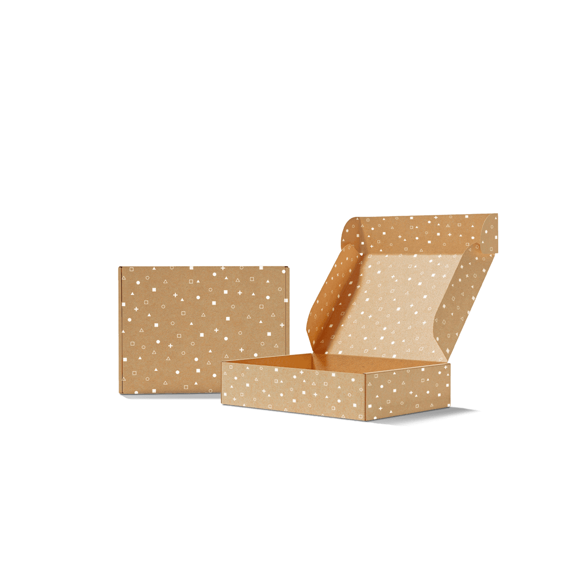
Custom Kraft Mailer Boxes

Create custom kraft mailer boxes around the real product, not a standard template, with the right flute, internal fit, print contrast, closure and insert for ecommerce orders that need protection and a clean natural presentation.

Brown Board Is Part of the Artwork

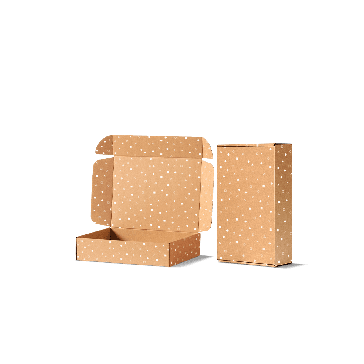
Brown kraft is not a neutral canvas. With Custom Kraft Mailer Boxes, the visible liner becomes part of the artwork, changing contrast, colour balance and how much ink the design needs.

That gives this style a clear job within custom mailer boxes. Choose kraft when the exposed brown surface supports the brand and the artwork can work with it. If the design depends on bright pastels, photographic colour or a very clean white base, the material choice should be challenged before the dieline is approved.

The kraft versus corrugated decision is useful here because kraft and corrugated are not opposite materials. A kraft mailer is commonly a corrugated mailer with a natural brown liner, while the flute and grade handle the protective work.

Let the Liner Stay Visible

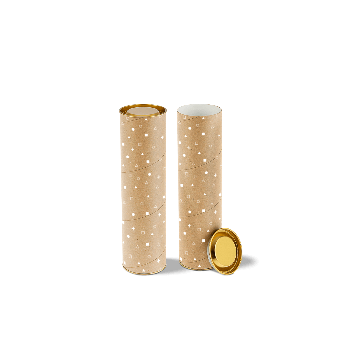
Kraft usually looks strongest when some of the board remains exposed. A controlled logo, repeat pattern, line illustration or strong typographic treatment can use the natural surface as one of the design colours rather than trying to cover it completely.

This can also reduce unnecessary ink coverage. The decision should come from the artwork, not from a rule that kraft packaging must always look minimal.

Do Not Approve Against a White Screen

A PDF on a bright monitor is not an accurate preview of ink on brown kraft. Screens emit light; kraft reflects it through a warm physical surface.

Review the artwork with the substrate in mind. If the exact printed colour matters commercially, use a physical reference or paid custom sample rather than treating the screen proof as colour approval.
Colour Behaves Differently on Kraft

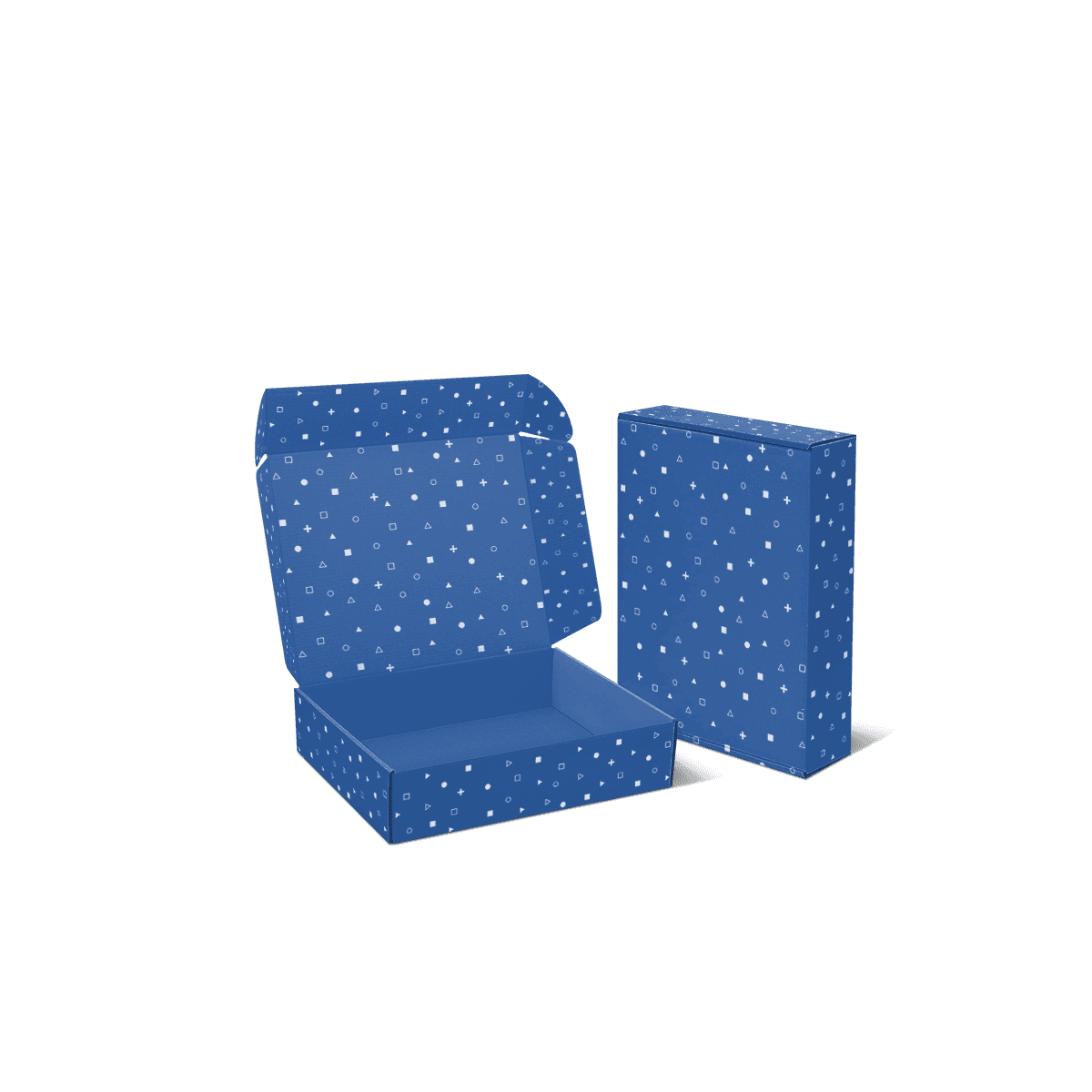
Natural kraft shifts the way printed colour is perceived. Dark inks usually retain stronger contrast, while pale colours can lose brightness because the brown base remains visually present.

That is not a defect. It is a property of printing onto a coloured substrate.

Use Contrast Before Complexity

Black, deep blue, dark green, burgundy and other stronger tones can work cleanly against natural brown board. Fine pale lines, soft yellows and light pastel artwork need more caution.

The exact result depends on the ink system, coverage and actual liner, so avoid promising that a colour will match its appearance on white stock.

If brand colour is central to the project, the packaging design workflow explains why colour should be judged together with substrate, print process and physical proofing.

Use White Ink for a Purpose

White ink can create contrast on kraft or provide a lighter base beneath selected artwork where the chosen print process supports it. It should not be treated as an automatic fix for every pale colour.

White opacity can vary by process and coverage. A thin white line and a large solid white area do not necessarily behave the same way. If white is a major part of the identity, test the physical result before committing to a large run.

Kraft Is Not a Strength Grade

The natural brown surface tells you how the mailer looks. It does not tell you how strong the finished box is.

Protection still depends on flute, paper weights, board grade, box dimensions, product weight and internal control. A white corrugated mailer can be stronger than a kraft one when its structural specification is heavier, and the reverse can also be true.

Use custom corrugated mailer boxes when flute, liner combination and transit performance are the main buying questions. Use Kraft Mailer Boxes when the brown liner and its print behaviour are central to the brief.

Choose Flute After the Product

A fine flute can suit compact ecommerce products where neat edges and a relatively smooth printable face matter. A heavier or deeper order may need more support.

Do not choose E flute simply because it looks refined or a thicker flute simply because it sounds safer. Product density, panel span, fragility and the delivery route still decide how much support is sensible.

That separation matters because the material surface and the structural core solve different problems.

Design With the Fibre

Natural kraft has more visual texture than a bright white coated surface. Fine detail, large solids and delicate tonal transitions need to be judged against that physical character.

The strongest kraft artwork often accepts a little material variation instead of trying to make the box behave like a coated retail carton.

Keep Fine Detail Legible

Very small reversed type, thin pale lines and subtle low-contrast graphics can disappear more easily against brown stock. Give important copy enough size and contrast to survive normal production variation.

Large solid areas also deserve testing. The material underneath can influence how uniform the colour appears, particularly when the artwork tries to mask the kraft surface completely.

If the design requires extensive full-colour coverage, compare the result and cost against a white-lined corrugated alternative rather than assuming kraft must remain the starting point.

Treat Brown as a Colour Reference

The kraft shade itself can vary between material specifications and production batches. A repeat order should therefore keep the approved material specification with the artwork rather than saving only the ink values.

If the brown tone is visually important, keep a physical approved reference. Repeat colour control on kraft is about ink plus substrate, not ink alone.

Match Print Method to the Job

The best printing method depends on quantity, artwork, colour control and how many designs are being produced. Kraft does not automatically require one-colour printing, and full colour is not automatically the better option.

The digital versus offset printing decision is particularly useful when run size and artwork variants change the economics.

One Colour Can Be Deliberate

A single dark ink can create a sharp, confident result on brown kraft when the logo and typography are strong enough to carry the design. It can also make repeat artwork easier to control than a complex palette fighting the substrate.

This should be a creative decision, not shorthand for a cheap box.

Full Colour Needs a Reason

CMYK artwork, photography and more complex graphics can be used where the production route and kraft surface support the intended result. The question is whether the natural brown base still helps the design.

If most of the kraft surface has to be hidden to make the brand colours work, a white liner may be a more logical canvas.

Premium offset printing is available where the quantity and artwork make it the appropriate route. Pantone colour can also be considered where tighter brand-colour control is genuinely needed.

Inside Print Changes the Contrast

A kraft mailer can use the inside as a second design surface, but the internal liner still needs the same print-aware thinking as the exterior.

Before placing a bold message under the lid, check the actual inside surface and how much of it remains visible after the product, tissue and insert are loaded.

Use the Lid for the Main Reveal

The inside lid usually gives the cleanest uninterrupted surface for a message, pattern or campaign graphic. Side walls and base panels are more likely to be covered by the contents.

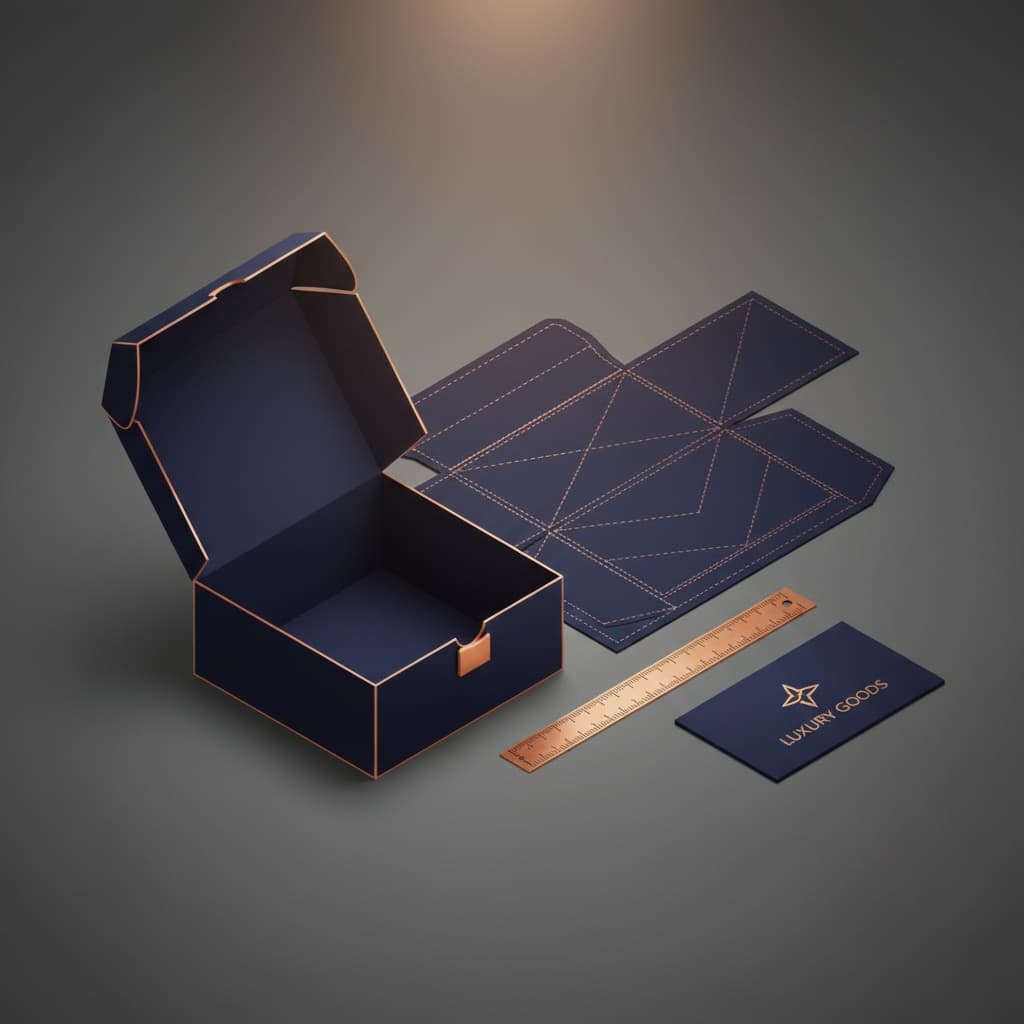
The packaging dieline workflow helps map those panels before artwork is finalised. The free dieline generator can provide a structural starting point from the required dimensions.

Do Not Overprint the Natural Effect

If both inside and outside are filled with heavy artwork, the project may lose the reason kraft was selected in the first place.

A restrained exterior with a stronger inside reveal can create contrast without making every panel compete for attention. The exact balance should follow the brand rather than a fixed kraft aesthetic.

Inserts Should Match the Visual Logic

Internal fitments can protect and organise products without breaking the material story. Paperboard or corrugated inserts and dividers can keep the presentation visually coherent where they suit the product.

The insert still has a mechanical job. It should control movement, support the product or create a useful removal sequence.

Do Not Add an Insert for Appearance Alone

A close-fitting soft product may not need one. Adding a raised platform simply to make the box look fuller uses material, internal depth and money without solving a protection problem.

For jars, candles, bottles or mixed kits, an insert can be much more valuable because it separates hard products and keeps them in position.

The outer box and fitment should be tested together because the insert changes the effective internal dimensions and can place pressure on the lid when it sits too high.

Sustainability Is a Separate Claim

The natural brown appearance can support a brand that already has a simple or material-led identity, but it is not proof of environmental performance.

Do not describe a kraft mailer as sustainable, biodegradable or fully recyclable merely because it is brown. Coatings, laminations, adhesives, labels, tape and internal components all affect the finished specification.

When recovery at end of use is the main requirement, recyclable mailer boxes take the more relevant system-level approach.

This distinction makes the kraft decision more credible. Choose the surface because it suits the product and brand, then assess environmental claims against the actual specification.

Protect the Approved Kraft Look

Repeat orders need more than the old artwork file. Keep the dieline, exact material specification, print method and a useful physical colour reference together.

A change in liner shade can alter the finished result even when the same ink formula is used.

Review Substitutions Before Printing

If the specified kraft stock is unavailable and a substitute is proposed, do not treat it as an invisible procurement change. Compare the colour, surface texture and print behaviour before approving a large repeat run.

The effect matters most for brands using restrained artwork because so much of the substrate remains visible.

For recurring e-commerce and subscription packaging, this material control can be as important as keeping the same box dimensions. Customers can notice when a familiar pack suddenly looks warmer, darker or rougher even though the logo has not changed.

Keep the Brief Surface-Specific

The most useful kraft-mailer quote explains what the brown liner needs to do visually. Start with the product dimensions and packed weight so the mailer can be specified correctly, then show the artwork instead of describing it only as “full colour” or “one colour”.

Point out any pale colours, white ink, Pantone requirement, large solid areas or inside printing that depend strongly on the substrate. State the quantity and whether the same artwork is expected to repeat, because the print route and colour-control approach can change with volume.

Treat the approved kraft stock as part of the colour reference. The quote should identify the liner specification alongside the print method so a later material substitution does not silently change the finished look.

If the timing is fixed, the fast-turnaround mailer process explains why settling the board and artwork early removes avoidable approval delays.

With the substrate, artwork and quantity fixed, request instant pricing for that exact combination.

FAQs

Yes, but the brown board can darken pale colours. White ink or a white liner may suit bright or colour-sensitive artwork.

Fine flute suits many light products. Heavier, deeper or fragile packs may need a stronger grade or thicker construction.

Yes. Inside print can be added beneath the lid or around the internal walls, subject to the chosen structure.

Not always. Inserts are useful when products can move, collide, tip over or need a more controlled presentation.

Process

How it works

Your Packaging Journey, From Idea to Production and Delivery

01

Tell Us Your Specs

Custom packaging boxes

Tell Us Your Specs

Provide size, quantity, printing, and finishes.

02

Get a Fast Quote

Custom packaging boxes

Get a Fast Quote

Instant transparent pricing, no hidden fees.

03

Design and Approval

Custom packaging boxes

Design and Approval

Artwork checks, revisions, and final sign-off.

04

Produce

Custom packaging boxes

Produce

Expert manufacturing to meet deadlines.

05

Ship to Your Door

Custom packaging boxes

Ship to Your Door

Hassle-free, flexible delivery options.

Get Your Quote for Custom Kraft Mailer Boxes

Share your product details, dimensions, quantity and artwork needs. We’ll help choose the right packaging style and send a clear quote.