Let Brown Stock Change the Design
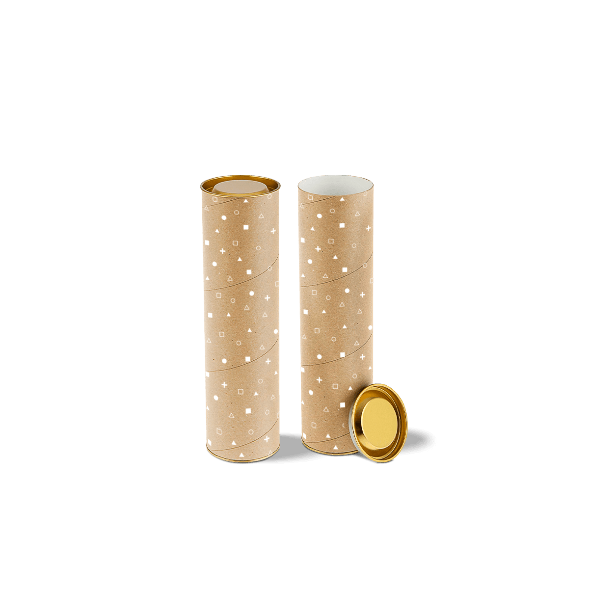
Brown kraft is not a neutral background. It changes how ink reads, how labels contrast and how much of the surface should remain unprinted.
Custom Kraft Mailing Tubes are therefore a material-led version of a mailing tube: the shipping job may be familiar, but the artwork has to be built for the stock rather than transferred from white paper unchanged.
For fixed-length rolled-item fulfilment mechanics, Custom Mailing Tubes covers loading, usable length and repeat dispatch. The kraft specification should stay focused on what changes because the outer surface is brown stock.
Treat Kraft as a Colour
Kraft is not a blank white canvas. Its brown tone sits underneath the printed artwork and changes how many inks appear.
Bright yellows, pale pastels and some lighter brand colours can look more muted when printed directly onto uncoated brown stock. Dark inks, strong line work and high-contrast typography generally have an easier job because they work with the substrate rather than depending on it disappearing.
If a design needs very bright colour or an opaque white element, confirm the print specification before final artwork is approved. The material discussion in how to design packaging for production explains why artwork cannot simply be moved from white stock to kraft and expected to look identical.