Decide What the Recipient Should Notice First
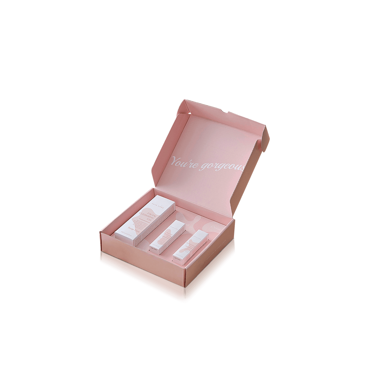
A PR box works best when the opening has one clear priority. Before choosing foil, board colour or a magnetic closure, decide what should command attention in the first few seconds: the hero product, a launch message, a product family or a campaign story.
That decision controls the internal layout. If every item has equal visual weight, the recipient has to work out what matters. For journalists, creators, retail buyers and campaign partners, the packaging should make that hierarchy obvious without needing a long explanation.
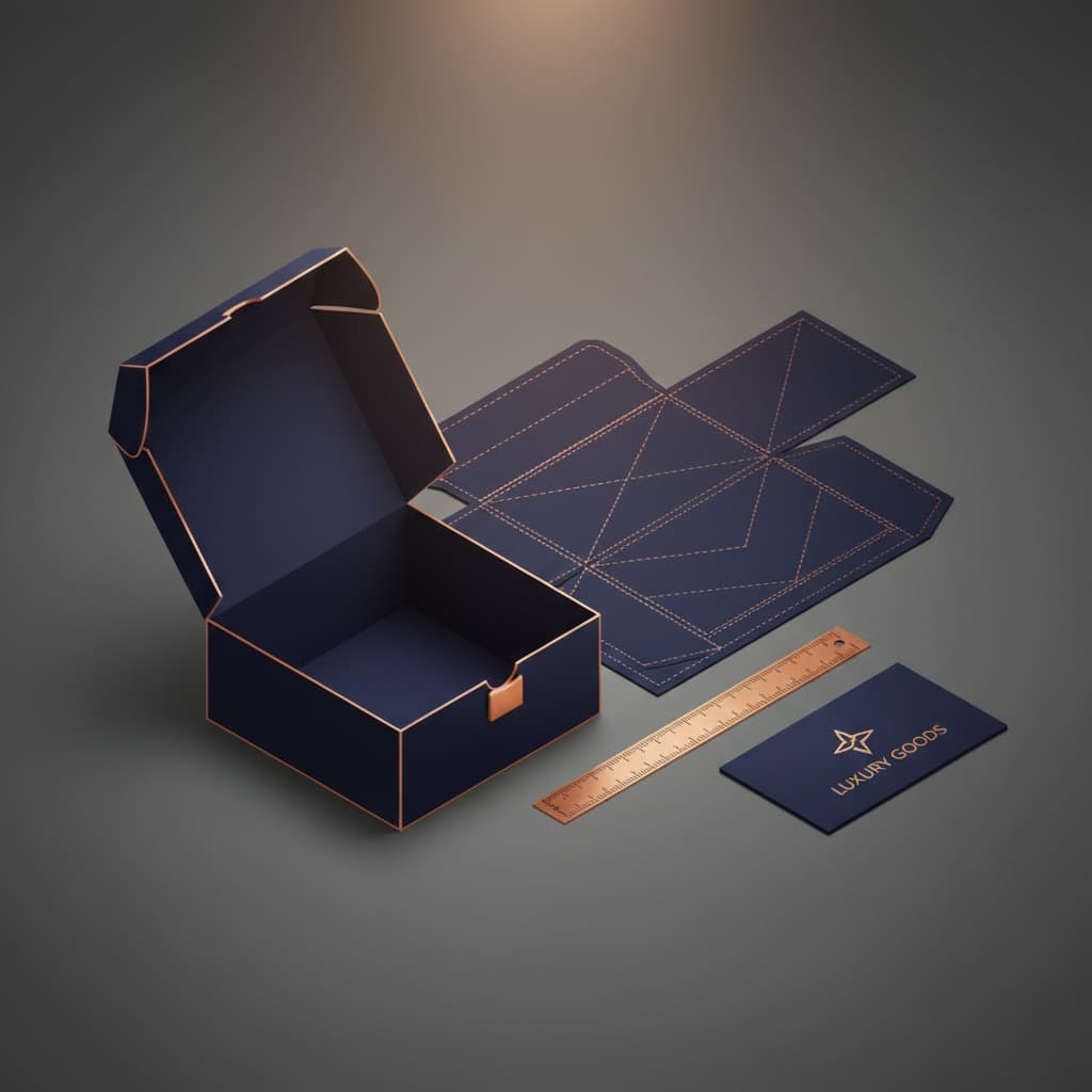
Custom PR Boxes therefore need more than attractive print. They need a deliberate relationship between the lid, product positions, insert height, campaign card and the order in which each element appears.
Give the Hero Product the Strongest Position
The lead product should usually be visible without removing several secondary items first. Position its recognisable face, label or silhouette towards the opener and give it enough space to remain visually dominant.
That does not mean putting it in the geometric centre every time. A larger object can sit off-centre and still lead the composition when the surrounding samples, cards or accessories are quieter and lower.
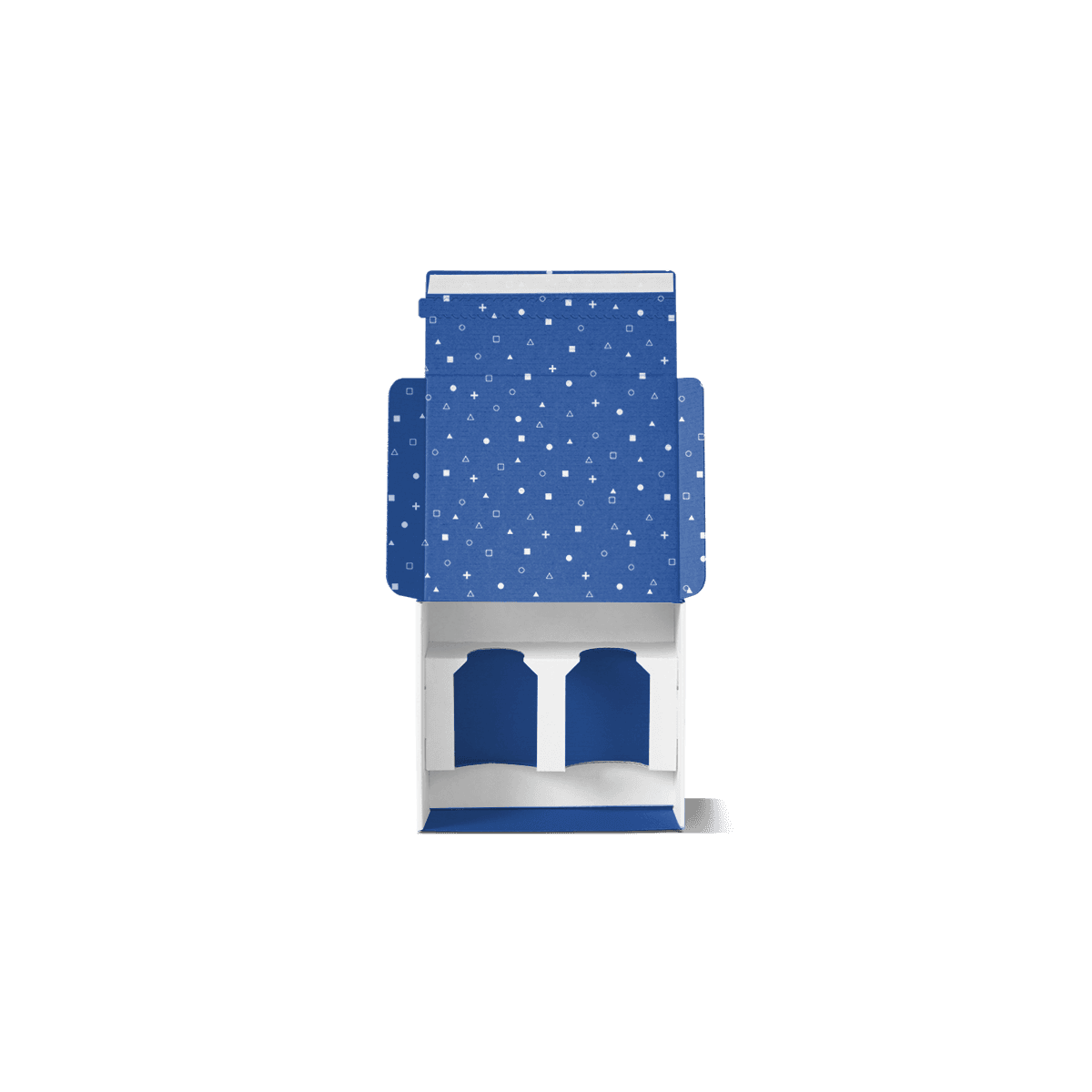
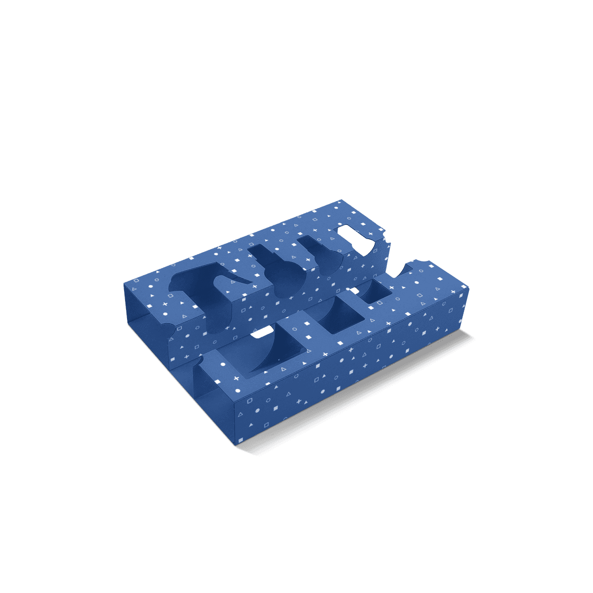
For mixed sets, Inserts and Dividers can control height, spacing and separation rather than simply stopping products from moving.
Place Campaign Copy After the Hero Moment
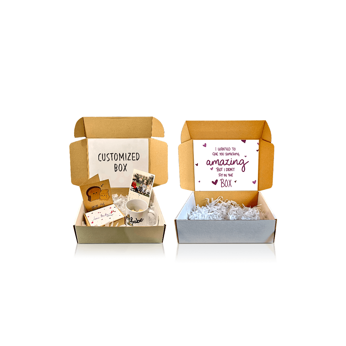
A campaign card placed directly over the products can create an extra layer of suspense, but it can also hide the strongest part of the box. Use it deliberately.
If the message must be read before the products are seen, make the card part of the opening sequence. If the product itself is the announcement, move the message to the inside lid, a side pocket or a smaller printed piece that does not block the first view.
The right answer comes from the campaign idea, not from a default PR-box layout.