Skip to content
Details

Custom Holographic Mylar Bags

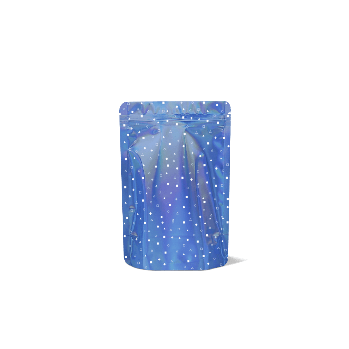
Holographic Mylar bags are designed for products that need stronger shelf impact, barrier protection and a pouch finish that feels more expressive than a standard metallic pack. They suit promotional lines, sweets, supplements, bath products and limited-edition retail launches.

Control What Catches the Light

A holographic surface should direct attention, not compete with everything printed over it. Custom Holographic Mylar Bags work best when the reflective film is treated as part of the graphic system rather than a decorative effect covering every available area.

Within custom Mylar bags, this is primarily a presentation choice. The colour-shifting surface changes as the viewing angle and lighting change, so artwork that looks balanced in a flat file can become much louder once the pouch is filled and moving on shelf.

Decide What Should Reflect

The strongest design does not always expose the holographic surface everywhere.

A logo, patterned field, side panel or selected background area can carry the effect while quieter printed zones hold the product name and essential information. Where the printing system allows controlled opaque coverage, areas can be visually separated from the reflective substrate rather than allowing every colour to compete with it.

Start by deciding which element deserves movement. If the answer is “everything”, the hierarchy probably needs more work.

Match Reflection to the Brand

Holographic packaging can feel playful, futuristic, energetic or promotional. It does not automatically feel luxurious.

A restrained skincare brand may look weaker if a rainbow surface conflicts with its established identity. A confectionery launch, festival product or limited flavour may gain much more from the same effect.

Choose it because the visual character fits the product and campaign, not because reflective film appears more expensive.
Design for Changing Light

Holographic film does not present one fixed colour. Light direction, viewing angle and surroundings influence what the customer sees.

That makes screen approval less reliable than it is for a conventional flat printed surface.

Check More Than One Angle

Review the design straight on, from an angle and while the pouch is moved.

A product name that is clear in one position can lose contrast when a bright reflection appears behind it. Fine lines and pale type are particularly vulnerable when the background changes continuously.

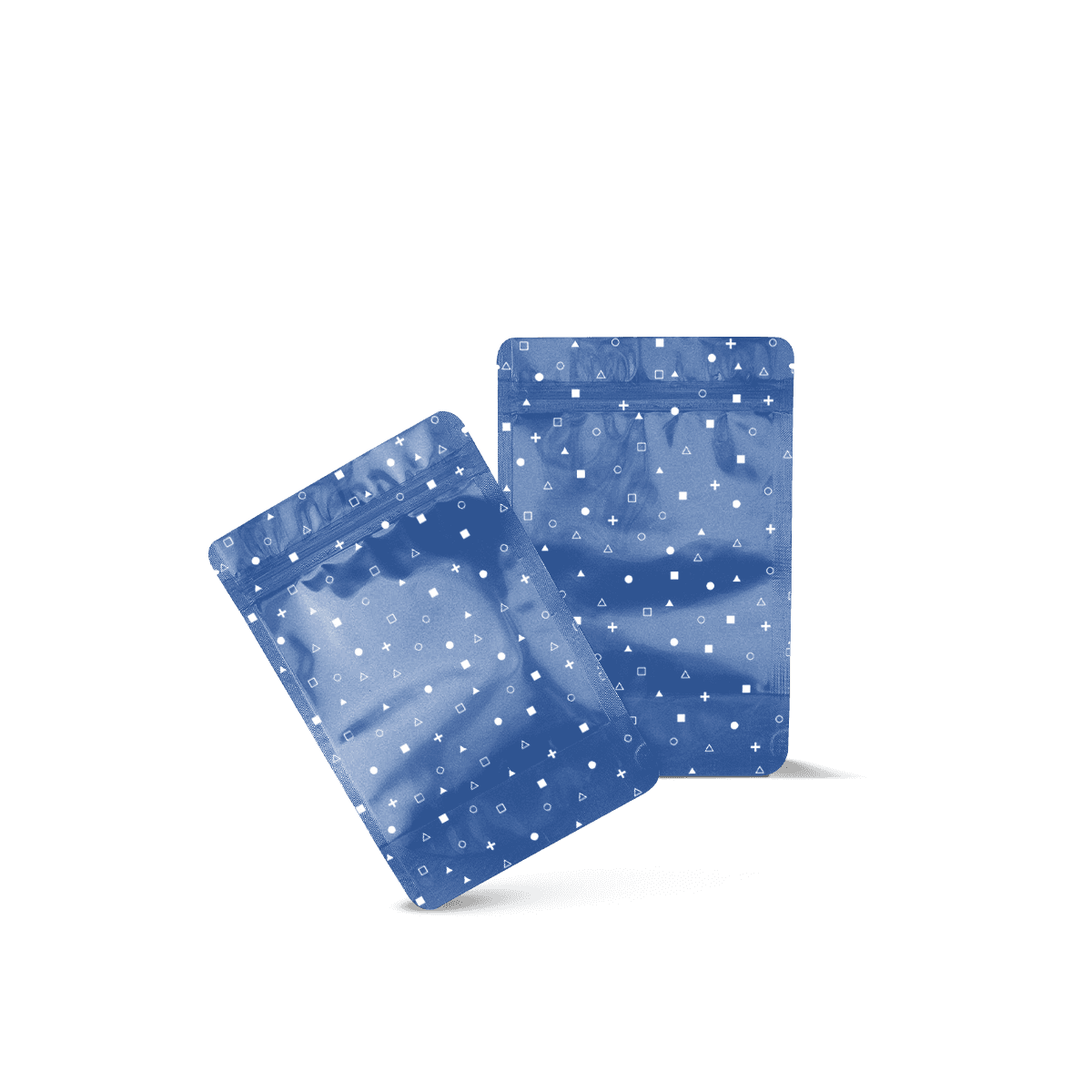
Use a free 3D mockup to review layout and proportion, but do not treat a static render as the final proof of reflective behaviour.

Retail Lighting Changes the Result

Bright overhead retail lighting, daylight and softer indoor light can make the same holographic surface behave differently.

If the packaging is mainly for counters, peg displays or busy retail shelves, assess the design under lighting that resembles that environment. A reflective concept that looks controlled in a design studio can become visually noisy under multiple spotlights.

For campaign-led launches and giveaways, Events, Hospitality and Gifting provides useful context because the same pouch may be viewed under event lighting rather than a conventional shelf.

Photography Needs Its Own Check

Reflective film can look substantially different in product photography depending on light position and camera angle.

If ecommerce or social imagery is commercially important, photograph a physical sample before producing the full campaign asset set. The pouch should still look recognisably holographic without requiring extreme lighting that misrepresents how it appears in normal use.

Give Important Text a Quiet Zone

The holographic effect can make packaging noticeable from a distance, but recognition only helps if customers can still read what the product is.

Product names, flavour cues, weights, instructions and regulated information need controlled contrast.

Protect the Product Name

Keep the highest-priority wording away from the busiest reflective areas unless the print treatment creates enough separation.

A bold dark wordmark over a controlled field may remain clear. Fine pale lettering over exposed rainbow reflection is far less predictable.

The principles in packaging design ideas apply particularly strongly here: hierarchy needs to survive the physical material, not only the artwork file.

Keep Small Copy Stable

Ingredients, usage information, batch fields and small reverse-panel text should sit on areas where contrast remains dependable.

Do not rely on a particular reflected colour to make small wording legible. That colour may disappear as soon as the pouch moves.

The safer approach is to give dense information a visually stable printed area and reserve the strongest holographic exposure for larger graphics.

Protect Barcodes From Visual Noise

Barcode placement needs predictable contrast and an area that stays reasonably flat.

Do not place a barcode across aggressive reflective graphics, gusset folds or other visually unstable zones merely to leave more of the front holographic. Operational information should win that trade-off.

Let the Filled Pouch Decide

Holographic artwork is normally prepared on a flat template, but customers encounter the formed pouch.

Curves, gussets and product pressure change how the reflective surface catches light. Large effects that look smooth on screen may break into several bright zones once the pouch expands.

Curves Multiply Reflection

A filled pouch rarely reflects light evenly from edge to edge.

Its centre can bow forward while the side areas rotate away. Each surface then throws a different colour or highlight towards the viewer.

Keep key graphics where the filled pouch presents them consistently. Background patterns and larger decorative elements can tolerate more movement.

Gussets Need Restraint

If the project uses a standing pouch, Stand Up Mylar Bags should determine the base and filled dimensions first.

The holographic artwork can then follow the actual folds. Do not position an important message across the lower gusset simply because it occupies visible space on the flat dieline.

Flat Pouches Reflect Differently

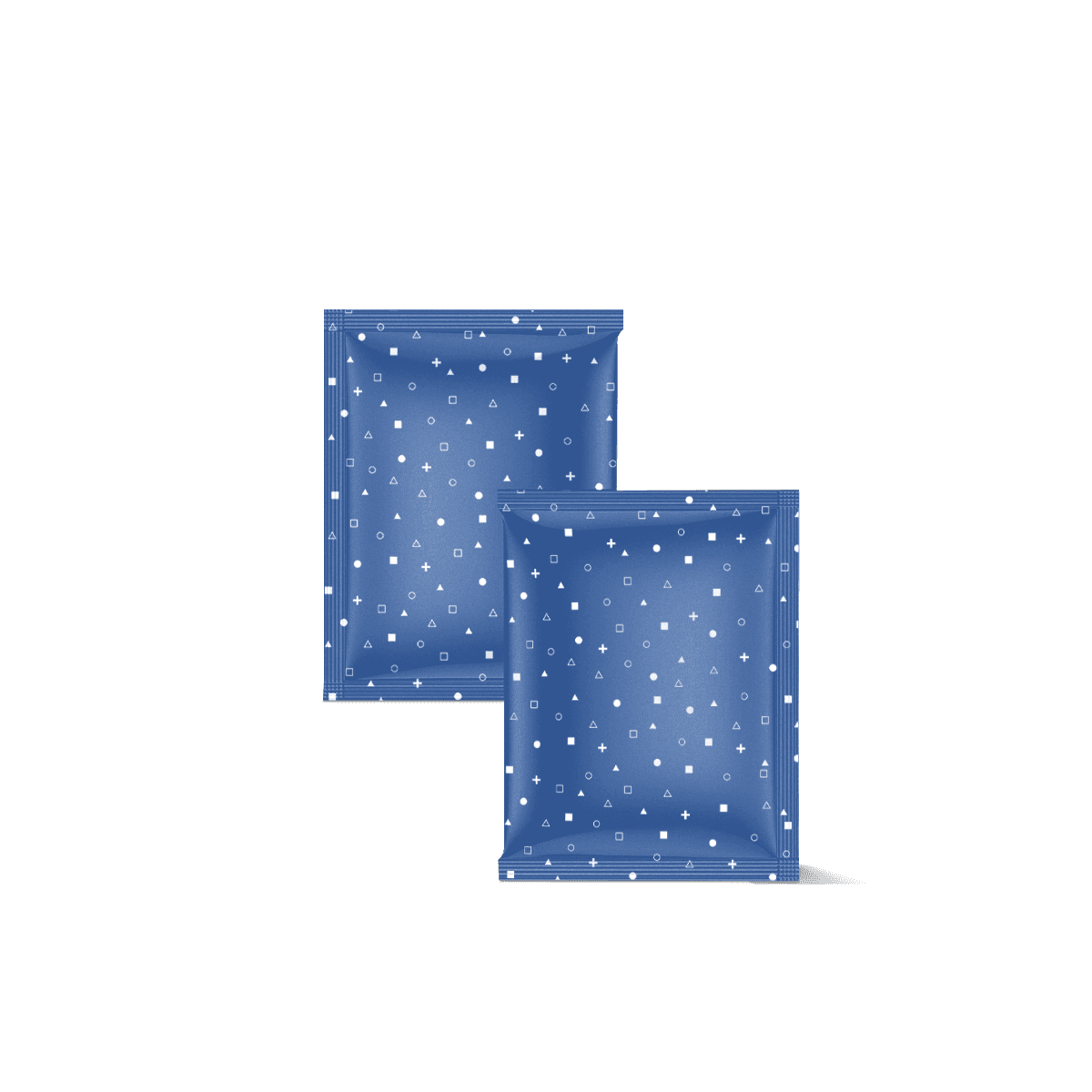
A low-profile pouch creates a flatter reflective field and can produce a more continuous effect than a deep filled stand-up pouch.

Where slim packing is the bigger structural requirement, Flat Mylar Bags should set the physical specification before the holographic treatment is developed.

Keep Finish and Barrier Separate

Holographic describes the visual surface. It should not be used as shorthand for a particular level of barrier performance.

The laminate still needs to suit the contents, storage period and handling conditions independently of the reflective appearance.

Verify Protection Separately

A highly metallic-looking pouch may appear more protective than a plain printed one, but visual appearance does not establish the laminate specification.

If an opaque foil-based barrier is the main requirement, Foil Mylar Pouches should lead that decision.

Choose holographic film because the visual effect earns its place. Confirm protection separately.

Visibility Solves Another Problem

Holographic coverage conceals or visually dominates the contents rather than showing them.

If colour, texture or portion appearance helps customers make the purchase, Window Mylar Bags may solve the retail problem more directly.

Combining transparency and heavy reflection can work, but both features need a clear role. Adding every available visual effect usually weakens rather than strengthens the package.

Build a Recognisable Product Range

Holographic film can be useful for differentiation, but it can also overwhelm the brand system if every SKU relies on a different reflective treatment.

Keep permanent brand signals stable first. Use the holographic effect to create a controlled layer of distinction.

Use Reflection as a Range Cue

One strategy is to keep the logo, typography and information system consistent while changing a limited colour or graphic element between flavours.

Another is to reserve holographic film for a limited edition, seasonal drop or premium sub-line while the core products stay on a quieter surface.

That creates a clear reason for the reflective finish rather than turning it into the default background for every product.

Keep the Range Readable

If five flavours already use strong colour coding, adding maximum holographic exposure to all five can make the shelf harder to read.

Test the products beside each other, not one at a time. The question is whether the range remains recognisable from a normal viewing distance.

For multiple artworks, digital versus offset printing helps frame the wider decision around quantity per design, colour requirements and repeat production.

Spend on the Effect Selectively

Holographic material or specialist print treatment should solve a commercial presentation problem.

It can make sense for launches, promotional editions and products competing in visually busy environments. It may add less value when the product is mainly sold inside another carton, shipped unseen or purchased through repeat subscription where shelf attraction is irrelevant.

Compare Cost Per Design

A holographic job with one stable artwork is commercially different from a launch containing eight small variants.

The custom Mylar bag cost breakdown explains why finish, film, total quantity and quantity per SKU need to be considered together.

Do not compare a holographic quote with a standard printed pouch using unit price alone. Confirm that the film, print coverage, closure and other specifications are genuinely comparable.

Avoid Stacking Extra Effects

Holographic film already creates substantial visual movement.

Adding heavy foil details, spot effects, several metallic colours and complex patterns can increase cost while reducing clarity. One controlled reflective idea often creates a stronger result than several competing premium treatments.

Spend the finish budget where the customer can actually perceive the difference.

Choose Closures Independently

The reflective surface should not decide how customers open the pouch.

A repeat-use product may need a zipper. A single-use item may rely on a heat-sealed top. A promotional sample can have very different access requirements from a full-size retail pouch.

If repeated access is central, Zip Lock Mylar Bags should determine grip space and zipper position first.

Keep opening features visually clear rather than allowing the holographic graphics to hide tear notches or handling cues.

Approve the Actual Reflection

For Custom Holographic Mylar Bags, the useful quoting brief should describe the visual effect as clearly as the pouch itself.

Share the finished pouch size or fill requirement, preferred pouch shape and quantity per artwork. Then explain how much of the surface should remain visibly holographic. A full rainbow field, restrained reflective background and selective holographic accent are very different creative directions even when the underlying pouch dimensions match.

Include the artwork or a strong visual reference where possible. Identify which areas must stay highly readable and whether the product will be viewed mainly on retail shelves, hanging displays, event counters or online photography.

If the holographic interaction with the artwork is commercially important, a physical custom sample is more useful than relying only on a screen preview. The mockup can establish composition first, while the sample helps judge the real material under changing light.

Once the reflective coverage, pouch shape and artwork count are clear, request a custom packaging quote around the effect you actually want rather than pricing “holographic” as one generic finish.

FAQs

It is the stronger choice when visual impact is part of the selling strategy and the pouch needs to stand out quickly in a busy retail setting. Holographic finishes work especially well for seasonal drops, giftable items and short-run promotions. If the product needs a quieter technical look, a standard foil pouch may be the better route.

Holographic Mylar Bags are more attention-led and more expressive on shelf, while Foil Mylar Pouches usually feel cleaner and more understated. Both can provide strong flexible-pouch performance when specified properly. The main difference is visual tone: holographic for impact and foil for a more restrained finish and broader design neutrality.

Yes, but the design has to be planned carefully. Reflective finishes can make fine text, low-contrast colours and busy layouts harder to read if the artwork is not balanced well. The safest approach is to control where the holographic effect sits, keep key text panels clear and test contrast before final production.

That depends on how the contents will be used after opening. A zip closure suits repeat-use products such as snacks, powders and supplements, while a heat-seal-only format is often better for samples, single-use portions and tamper-led presentation. The holographic finish does not decide the closure. Product use does.

Confirm the fill weight, product density, closure type and required barrier level first. Then review how reflective the finish should be, where branding and legal text will sit and whether the pouch must stand, hang or fit inside another pack. It also helps to share the target retail setting, because that affects the right balance between visual effect and readability.

Process

How it works

Your Packaging Journey, From Idea to Production and Delivery

01

Tell Us Your Specs

Custom packaging boxes

Tell Us Your Specs

Provide size, quantity, printing, and finishes.

02

Get a Fast Quote

Custom packaging boxes

Get a Fast Quote

Instant transparent pricing, no hidden fees.

03

Design and Approval

Custom packaging boxes

Design and Approval

Artwork checks, revisions, and final sign-off.

04

Produce

Custom packaging boxes

Produce

Expert manufacturing to meet deadlines.

05

Ship to Your Door

Custom packaging boxes

Ship to Your Door

Hassle-free, flexible delivery options.

Get Your Quote for Custom Holographic Mylar Bags

Share your product details, dimensions, quantity and artwork needs. We’ll help choose the right packaging style and send a clear quote.