Skip to content
Details

Custom Kraft Sleeves

Kraft sleeves use natural brown paperboard to add branding, product detail and a more organic shelf look around boxes, trays or individual items without needing a fully printed outer carton.

Design for Brown, Not White

Artwork built for white paperboard often loses contrast when it is moved straight onto natural kraft. Custom Kraft Sleeves need to be designed with the brown stock treated as part of the colour system, not as a neutral background that disappears after printing.

Dark linework, simple typography and controlled negative space can work with the fibre surface instead of trying to cover it. For bright cosmetic graphics, pale pastels or colour-critical photography, the same material can work against the design.

The live sleeve family includes several structures and materials, but kraft should keep one clear ownership: the material itself changes the print result and visual character.

Build Contrast Before Colour

Kraft rewards artwork that is planned for a darker, warmer substrate. A colour that looks clean on a calibrated screen or white proof can become duller, darker or warmer once printed directly onto brown stock.

Dark Ink Has an Advantage

Black, deep green, navy, burgundy and other stronger colours normally retain clearer contrast because they are already substantially darker than the kraft base.

Small, low-contrast typography can also lose clarity against natural fibre, so simplification often works better than extra decoration.

The packaging design workflow explains why material should be fixed before final artwork, because coated white paperboard and uncoated kraft do not reproduce the same file in the same way.

White Needs a Plan

White is not created by leaving the kraft unprinted. Unprinted areas remain brown.

If the design needs a white logo, pale illustration or brighter colour sitting over an opaque light base, that requirement has to be built into the print specification. It can change production method, artwork separation and cost.

Do not add white simply because kraft feels too dark after the design is finished. Decide whether the contrast is essential at the beginning.

Photography Needs Testing

Detailed photography and subtle gradients are less forgiving on kraft than strong graphic artwork. Natural stock can mute highlights and alter skin tones, product colours or fine tonal changes.

If photographic accuracy is central to the sleeve, compare kraft against a white or coated stock rather than forcing the material choice. The kraft appearance should earn its place.
Let the Fibre Stay Visible

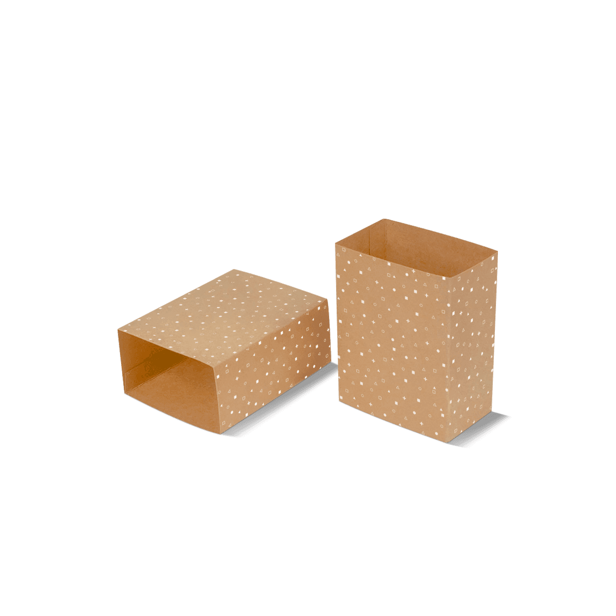
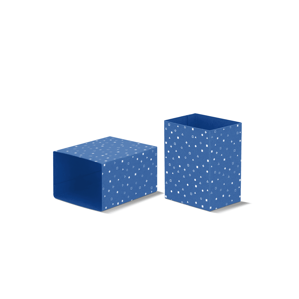
Kraft has value because the stock itself is visible. Covering nearly every millimetre with heavy ink can remove much of the character that justified choosing it.

Leave Intentional Open Areas

Unprinted kraft can work as an active part of the layout. It can become the background around a logo, separate product variants or create contrast against one strong printed panel.

Leaving stock visible should still look intentional, not unfinished.

Expect Natural Variation

Natural brown stocks are not visually identical to bright white coated paper. Shade and fibre appearance can vary between grades and production batches.

Small natural variation can suit kraft-led branding, but it becomes a problem when the brand expects the brown itself to behave like a tightly controlled Pantone colour.

If the exact brown is part of the identity, specify the approved stock rather than saying only “kraft”. Custom Packly can keep the chosen material, print reference and dieline tied together for repeat production instead of relying on a generic material name.

Choose Kraft for the Product

Kraft is strongest when the material supports what the product already communicates. It should not be added because natural brown packaging is assumed to suit every handmade or premium brand.

Soap Can Use the Material

Handmade bars, botanical soaps and products with visible texture often sit naturally with kraft because the sleeve can feel tactile without competing with the product itself.

Where the bar-specific decision includes reveal width, moisture exposure and fit around irregular edges, Soap Sleeves deal with that product geometry directly. Kraft then becomes one material choice within that job rather than the whole strategy.

Food Needs a Contact Decision

A kraft sleeve around a sealed tray or outer carton is different from paper that touches exposed food.

If food contact is involved, say so before selecting the stock, ink or coating. Food Packaging Sleeves focus on the filled container, grease, condensation and pack-out conditions that matter beyond colour and texture.

Bright Brands May Fight It

Kraft can be the wrong choice for a brand built around crisp white space, neon colour, accurate product photography or very pale tones.

Material should support the brand rather than force the artwork into a visual language it was never meant to use.

Brown Is Not a Green Claim

Natural colour is easy to confuse with environmental performance. A brown kraft sleeve may look less processed, but appearance alone does not prove recycled content, recyclability, responsible sourcing or a lower overall impact.

The eco-friendly custom packaging approach is more useful: consider material quantity, exact stock, coatings, adhesives, product protection and end-of-life together instead of using “kraft” as a shortcut for sustainability.

Ask What the Stock Is

If recycled content, sourcing or recyclability matters to procurement, specify the requirement for the exact material rather than assuming all brown board has the same composition.

Custom Packly holds major applicable UK and EU certifications. Where certification or compliance is part of the buying requirement, it should be matched to the specific material and application rather than used as a vague claim around the finished sleeve.

Count Every Added Layer

Lamination, foil, adhesive, windows and other additions can change the material story. Some may be justified by performance or brand value, but they should be chosen consciously.

Fit Feels Different on Kraft

Uncoated kraft can create more surface friction than a very smooth coated paperboard. That affects how a sleeve slides over another box, tray or product.

Texture Changes Slide Behaviour

A fit that feels comfortable in smooth white card can become noticeably tighter when both the sleeve and the surface underneath are textured.

Do not copy dimensions from a smoother stock and assume the handling will remain identical.

Measure the finished item and consider how staff will apply the sleeve. If repeated sliding is central to the job, test the real material combination rather than only the geometry.

Fold Accuracy Still Matters

Kraft does not excuse soft corners or poor alignment. Creases still need to suit the material thickness and the main face still needs to land where the artwork expects it.

If firmness, caliper, large unsupported panels and crease performance are the primary decisions, Cardboard Sleeves should own that brief instead. Kraft Sleeves are material-led first.

Material Does Not Choose Shape

Kraft describes the stock, not one fixed sleeve structure. It can become a narrow band, a wider wrap or a sleeve around an existing box depending on what the product needs.

If only a slim strip is required for naming, grouping or light restraint, Belly Band Packaging gives the structure a clearer starting point.

If an existing carton already works and needs a broader branded layer, Box Sleeves address that outer-wrap decision more directly.

The parent Sleeve Packaging area is useful when coverage, slide action, food use or another function is still unresolved. Choose the job first, then decide whether kraft is the right surface for it.

Finish Without Hiding Kraft

Finishing can sharpen kraft packaging, but the strongest result often comes from one controlled accent rather than trying to make natural stock behave like glossy coated board.

Foil Works Through Contrast

A compact foil mark can create a clear contrast against brown kraft without covering the fibre character. Blind embossing or debossing can add texture while keeping the palette restrained.

The finish should still respect folds, overlaps and glue areas.

Lamination Changes the Surface

Lamination can alter both appearance and touch. A heavy gloss film may make a kraft sleeve feel substantially less natural than the uncoated stock that was chosen in the first place.

That can still be correct where scuff resistance or a particular finish is required.

Stock, print and finishing can be resolved together through packaging customisation so surface effects do not bury the material decision.

Print Method Follows Artwork

The brown substrate changes the visual result, but it does not remove the normal commercial choice between digital and offset production.

Stable Artwork Favours Control

Premium offset printing becomes particularly useful for established runs where dark solids, fine typography, Pantone references or repeat colour consistency matter.

A Pantone reference on kraft should not be expected to look identical to the same reference on coated white paper.

Many Versions Change the Maths

A kraft range may use one stock and one sleeve size across several scents, flavours or product names. The total order quantity can look large while each individual artwork version remains relatively small.

The digital versus offset printing decision should therefore use quantity per artwork, not only the combined number of sleeves.

MOQ starts from 100, which gives new kraft-led ranges room to prove the material and artwork before committing to a large quantity of one version.

Approve the Real Surface

A screen is useful for layout. It is a poor substitute for seeing ink against the actual brown stock.

Use Mockups for Position

A free 3D mockup can show coverage, logo placement, panel balance and how the kraft sleeve sits around the product. It is especially helpful when the base box or product remains partly exposed.

It should not be treated as an exact colour proof for natural stock.

Use Samples for Material Judgement

Free samples are more useful when the question is tactile: how brown the stock feels visually, how dark ink sits on it and whether a finish changes the surface too much.

For colour-critical artwork, unusual white ink, dense coverage or a demanding finish, approval should focus on the real material rather than trusting a monitor.

The paperboard, corrugated and rigid material breakdown reinforces the same principle: material is a performance and print decision, not simply an aesthetic label.

Send the Kraft Target

The most useful brief for Custom Kraft Sleeves is a visual target rather than the word “natural”. Show the product or box the sleeve will wrap and identify the brown appearance you expect, the artwork colours that must stay legible and any parts of the stock you want deliberately left unprinted.

If you already have a kraft package you like, include a photograph or material reference. If the exact shade does not matter, say that too.

Custom Packly can then coordinate material choice, sizing, artwork setup, print and finishing through one experienced packaging team. Guaranteed 4–6 working day production and delivery supports launches once the intended stock and artwork direction are clear.

Send that material reference through the custom packaging quote. The aim is to price the kraft sleeve you actually want to see in hand, not a generic brown wrap that happens to fit.

FAQs

Kraft sleeves are usually the better choice when the brand wants a warmer, more natural and more tactile presentation. They work especially well for handmade, organic-feeling or craft-positioned products where the board itself adds to the message. White printed sleeves are often stronger when bright colours, very fine image detail or a cleaner polished look matter more than material character.

Yes, they print well when the artwork is designed for the stock rather than forced onto it. Dark inks often look strong on kraft and white ink can add contrast where clarity is important. Buyers should keep in mind that kraft’s brown base will influence colour appearance, so exact bright colour matching is usually harder than it is on white board.

Start with the full size of the box or product the sleeve will sit around, then confirm sleeve depth, board thickness and how snug the fit should be. It is also worth deciding early whether the design needs white ink, cut-out areas or a glued seam. Those choices affect appearance, cost and how the sleeve performs during packing and handling.

Yes, they are widely used as secondary packaging for products like soaps, candles, confectionery and dry goods because they add branding without requiring a full outer carton. The key point is to confirm whether the sleeve is only an outer layer or whether direct product contact is involved. If direct contact matters, the full packaging setup should be specified accordingly.

Yes, and that is one of their strengths. Kraft sleeves often look premium through restraint rather than excess. A well-proportioned layout, strong typography and a clean fit can create a better result than adding too many effects. Where extra lift is needed, small details such as white ink, blind debossing or selective foil can sharpen the finish without losing the natural feel.

Process

How it works

Your Packaging Journey, From Idea to Production and Delivery

01

Tell Us Your Specs

Custom packaging boxes

Tell Us Your Specs

Provide size, quantity, printing, and finishes.

02

Get a Fast Quote

Custom packaging boxes

Get a Fast Quote

Instant transparent pricing, no hidden fees.

03

Design and Approval

Custom packaging boxes

Design and Approval

Artwork checks, revisions, and final sign-off.

04

Produce

Custom packaging boxes

Produce

Expert manufacturing to meet deadlines.

05

Ship to Your Door

Custom packaging boxes

Ship to Your Door

Hassle-free, flexible delivery options.

Get Your Quote for Custom Kraft Sleeves

Share your product details, dimensions, quantity and artwork needs. We’ll help choose the right packaging style and send a clear quote.